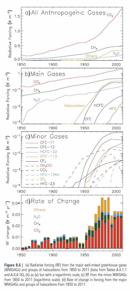
How global warming works
For Americans who don't mind seeing a few numbers
Vaughan R. Pratt
Stanford University
Preface
This account of global warming is for Americans who don't mind seeing a few numbers. Americans because they prefer feet and Fahrenheit to meters and Celsius, and a few numbers for those who like a little perspective. If you see a centimeter in this account, feel free to step on it.
Everyone uses the same units of seconds and years for time. As for weight, a long ton, or imperial ton, is 2240 lbs while a metric tonne is 2206 lbs, about 1.6% less. I'll give weights in tons which you can assume is close enough to both of those scales for our purposes.
A metric tonne is exactly a million grams or one megagram, so a trillion tonnes (a million million tonnes) is a trillion million grams or one exagram, abbreviated 1 Eg. This is the most convenient unit for quantifying Earth's atmosphere, which weighs 5,150 Eg.
For comparison this is the same weight as the top 47 feet of the water in the ocean. However if that weight of water were somehow spread over the whole of Earth's surface it would only be 33 feet deep. This gives us another unit of weight for the atmosphere: equivalent feet of water.
Whereas the mass of the whole atmosphere is 33 feet in that scale, the mass of its greenhouse gases back in 1800 was about 1.15 inches, of which about 15% by weight was CO2. Since then CO2 has risen to 20% of greenhouse gases and at the present rate of increase will be up to 36% by 2100. The effect of greenhouse gases will be an important part of this account of modern climate.
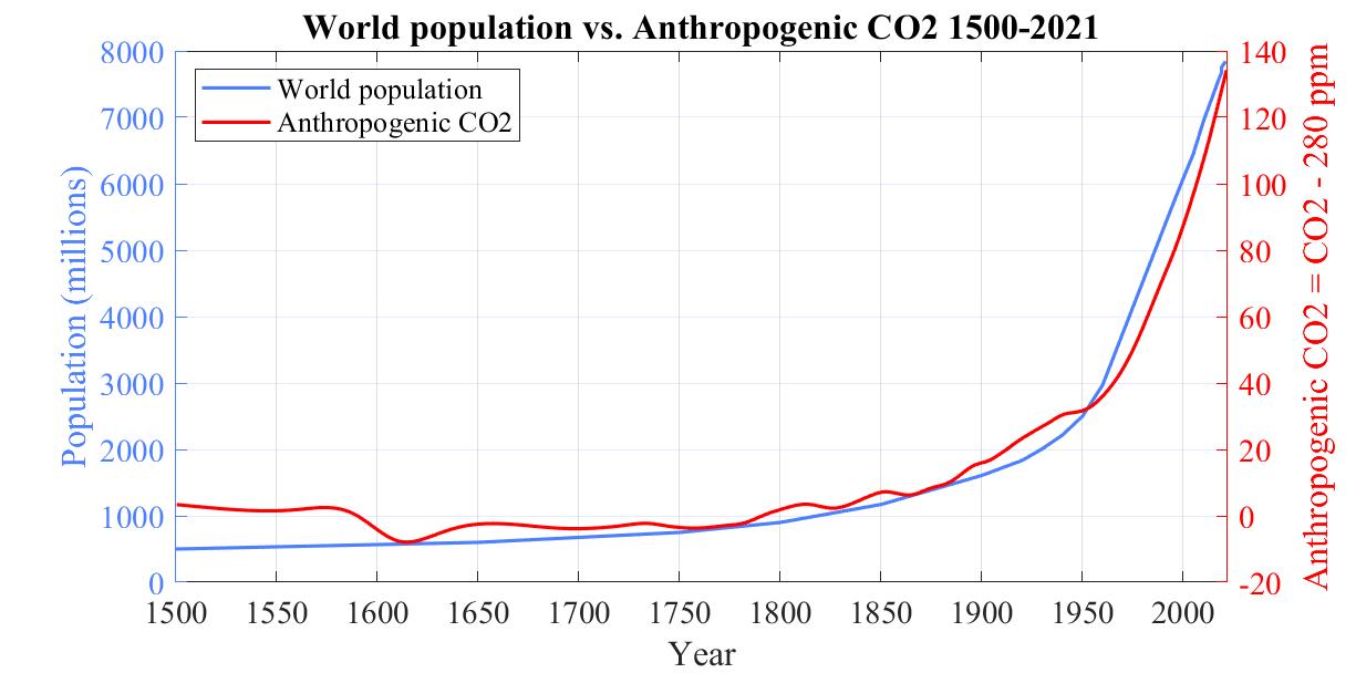
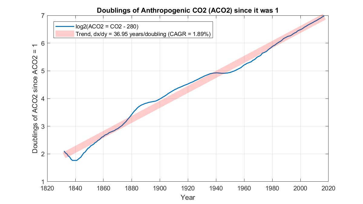
Looking over the period between 1500 and 2021, we see an interesting correlation between rising population and rising anthropogenic CO2 defined as CO2 minus 280 ppm, that is, CO2 in excess of the natural background level of 280 ppm.
The correlation between rising population and rising anthropogenic CO2
What warms Earth's surface?
The Sun, of course.
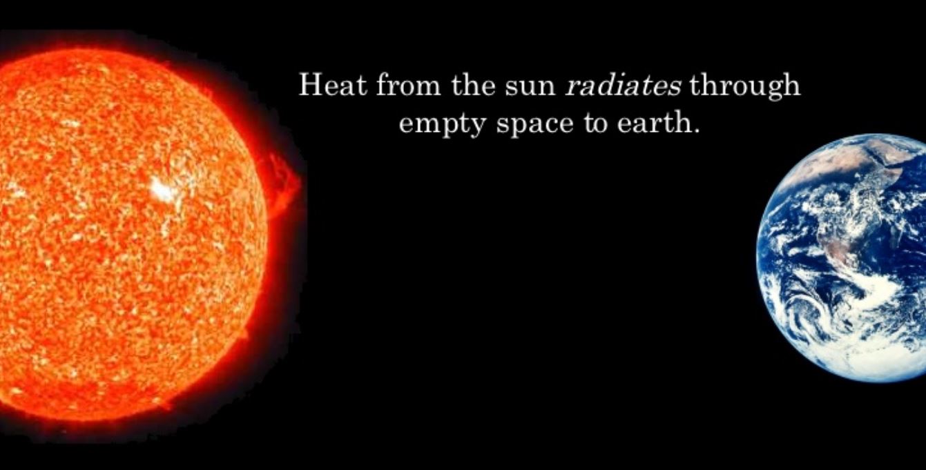
The Sun warms the Earth across 93 million miles of space
If Earth retained all that incoming heat it would keep getting hotter until the oceans boiled away.
Earth's oceans all boiled away
Obviously that hasn't happened.
This is because as Earth gets hotter it radiates more of that incoming heat to space.
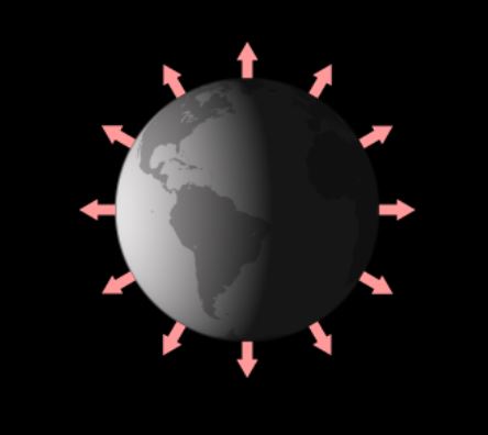
Outgoing Longwave Radiation (far infrared wavelengths)
Once Earth has reached a temperature where the heat it is radiating to space exactly equals the heat it has been absorbing from the Sun, its temperature stops rising. This situation is called thermal equilibrium.
For any planet this temperature is called its effective temperature.
By pure coincidence, the effective temperature of Earth happens to be almost exactly 0 °F. (In Celsius or Centigrade, -18 °C, in Kelvin or absolute temperature, 255 K.)
Now fresh water freezes at 32 °F. Seawater freezes a little colder, namely at 28.4 °F. But 0 °F is way colder than that, and at that temperature the oceans should be frozen solid.
Earth's oceans all frozen solid
Obviously that hasn't happened either. For the most part the oceans are neither steam nor ice. So what's going on?
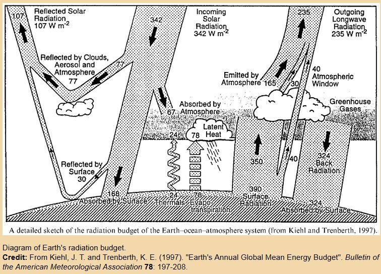
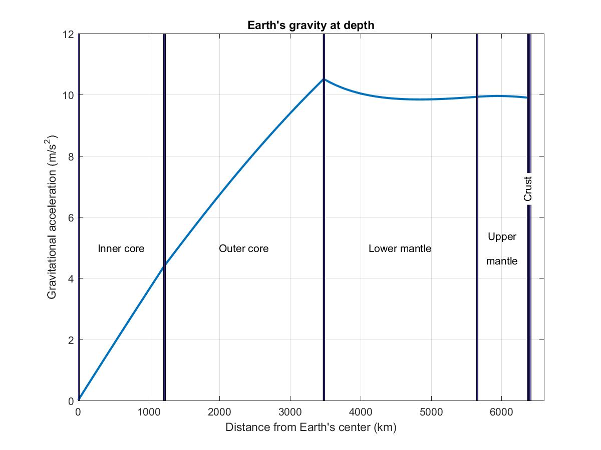
What's going on is that there is more to Earth than just its oceans and land. There is also its atmosphere.
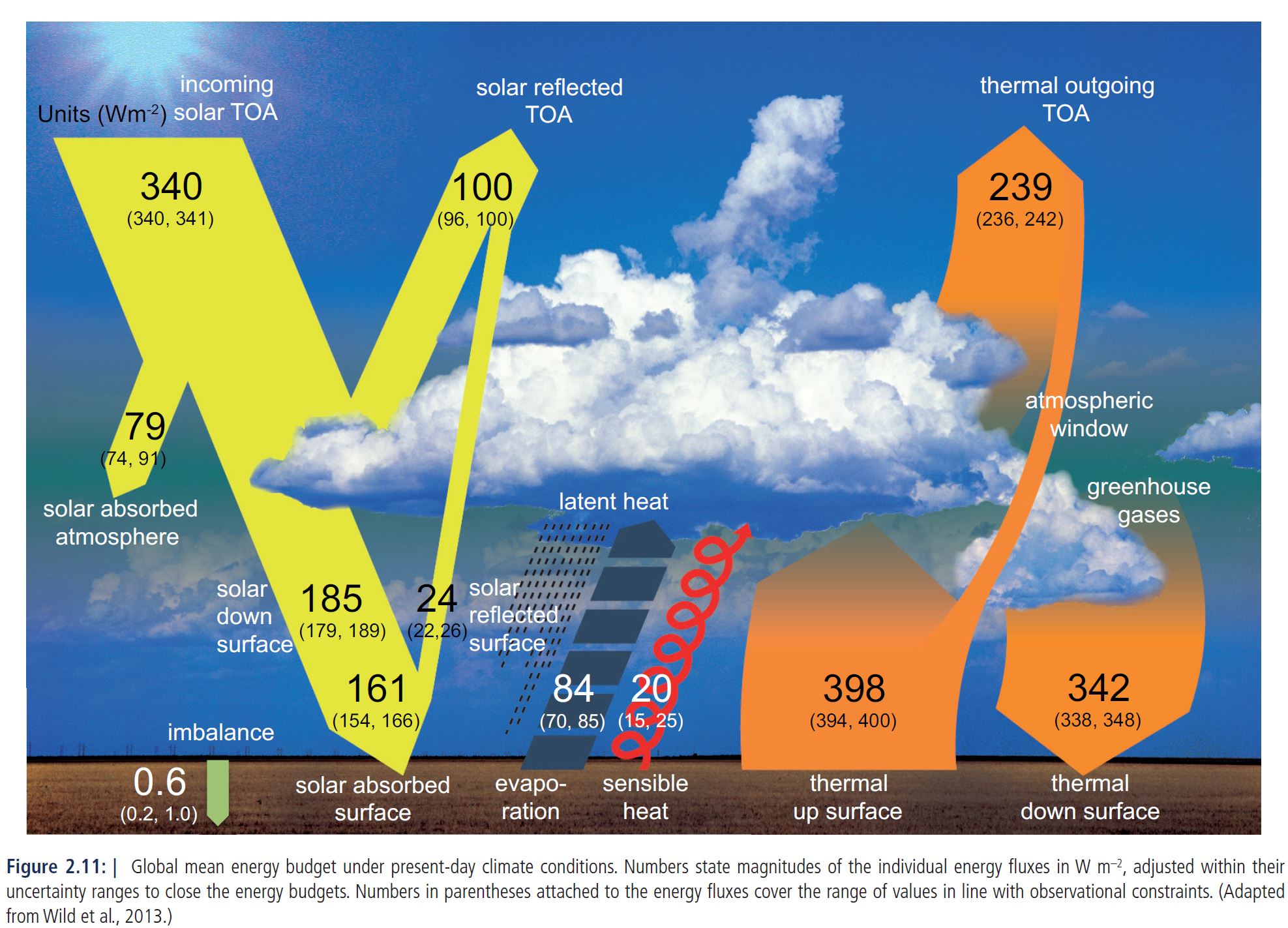
For the purpose of radiating the Sun's incoming heat back to space, Earth's atmosphere does more than 90% of of that work. Earth's surface itself radiates a little to space, but the greatest part is radiated from the troposphere, constituting about three-quarters of Earth's atmosphere by mass. The troposphere ends at the tropopause, which is nominally at about 35,000 feet (but lower at higher latitudes). Above the tropopause is the stratosphere, which contains most of the remaining quarter of the atmosphere.
Lapse rate
As you rise above sea level, whether by balloon ride, in a plane, or climbing a mountain, you will find the air cooling at a rate of about 3.5 °F per thousand feet. This rate of cooling with altitude is called the atmosphere's lapse rate. By the time the balloon has reached 35,000 feet the temperature should have dropped about 120 degrees.It turns out that the effective temperature of the Earth roughly coincides with the temperature at the middle of that 35,000 foot balloon ascent. Earth's radiation to space is holding the overall temperature of the atmosphere to ±60 °F on either side of that middle. So if at the middle of the ride the temperature is at 0 °F, then at the start of the ride it must be 60 °F and by 35,000 feet it must have fallen to -60 °F.
Now every point of the atmosphere radiates heat uniformly in all directions. That is, if you imagine a virtual sphere say a foot in diameter anywhere in the atmosphere, the radiation being emitted from the very center of that sphere is equally strong everywhere it passes through the surface of that sphere.
However the radiation directed downwards or sideways obviously can't escape to space and will be eventually captured. Only upwards radiation can escape to space provided it is not absorbed by the atmosphere on the way up. The higher the source of that upwards radiation, the less atmosphere it has to punch through and the better its chances of escaping to space.
How can the atmosphere radiate?
About 99.7% of Earth's atmosphere by weight is completely transparent to Earth's thermal radiation, the kind of radiation that is needed to keep Earth's oceans from boiling away. Had it been 100%, all the radiation from Earth to space would be coming directly from the surface, whose temperature would therefore be Earth's effective temperature of 0 °F.
The remaining 0.3%, weighing about 15 Eg, consists of gases capable of both absorbing and radiating Earth's thermal radiation. Even though this is a very small proportion of the atmosphere it has nevertheless trapped and reradiated enough radiation that on average the radiation that finally makes it to space has been coming from about halfway up the 120 degree scale in the previous section. This altitude is therefore where the 0 °F temperature is. This makes Earth's surface temperature around 60 °F.
The altitude at which the radiation is emitted influences the amount that escapes to space in two ways. Hot gases radiate more strongly so emission at low altitudes is stronger. On the other hand the path to space is longer, reducing the chances of this stronger radiation escaping to space.
These two influences are summarized in the following picture.
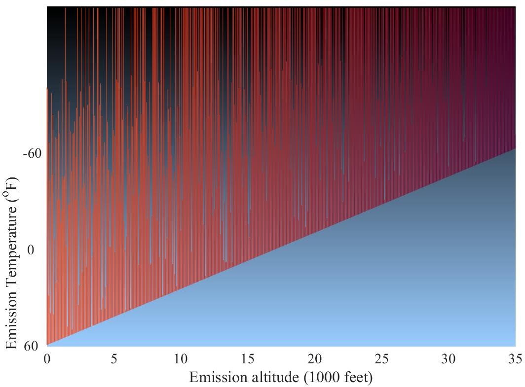
OLR from low altitudes: stronger but less likely to reach space
The x-axis in this picture gives the altitude of emission, up to 35,000 feet. To avoid clutter it shows only the radiation directed vertically upwards.
And for further clarity the picture puts the radiation from the surface on the left and the radiation from 35,000 feet on the right, with all intermediate altitudes in between.
Radiation from low altitudes is stronger, shown with brighter lines, because of the higher temperature there. However it is also more likely to be captured before it can escape to space, shown with a greater proportion of lines stopping prematurely. Given this tradeoff it is not all that surprising that Earth's effective temperature of 0 °F occurs in the middle of that range.
But if it had occurred at only a quarter way up, that is at about 9,000 feet, then Earth's surface temperature would be only 30 °F. Since this is a couple of degrees below freezing, a lot more of Earth's oceans would be frozen!
What are the main greenhouse gases?
The two greenhouse gases with the greatest impact on Earth's surface temperature are water vapor and carbon dioxide, CO2.
H2O and CO2 molecules each contain three atoms and their respective greenhouse effects can therefore be assumed to be roughly equal. Molecules like methane, CH4, have five or more atoms and because of this greater number their contribution to the greenhouse effect of each ton, called their global warming potential, is considerably greater. However their mass is less than one percent of that of CO2 and their contribution to global warming is therefore negligible by comparison, their greater warming power per ton notwithstanding.
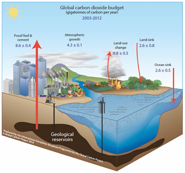
The mass of water vapor in the atmosphere is fairly constant at around 12.8 Eg. Before the industrial era CO2 contributed 2.2 Eg to that, bringing it up to 15.0 Eg. (To convert ppm of CO2 to its mass in exagrams, divide by 128, more precisely 127.84. For the mass of the carbon alone divide instead by 468.8. A commonly used unit is GtC for gigatons of carbon; 1 EgC is 1000 GtC.)
Back when the mass was 15.0 Eg, these two greenhouse gases added about 60 °F to the surface temperature. Each Eg of greenhouse gases can therefore be blamed for about 60/15 = 4 °F.
Since then however the mass of CO2 has increased by a further 1 Eg, bringing the total mass of the two main greenhouse gases to 16 Eg.
According to theory this increase in GHGs should raise the temperature by about 4 °F. But not necessarily right away as the oceans have an enormous thermal inertia that slows down the warming; it will take several centuries to reach thermal equilibrium, even assuming no further increase in GHGs. (And therefore the commonly cited 1.5 °C (2.7 °F) target will be passed even if by some miracle we were to achieve net zero CO2 emissions next year.)
Now the following plot shows that land temperature has risen by about 2.3 °F over the past 50 years.
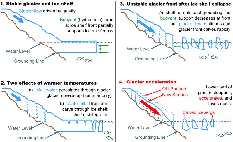
If all of a sudden CO2 stops rising, in a few centuries that extra 1 Eg of greenhouse gases can be expected to increase the surface temperature by some 4 °F. Already we have seen the temperature increase by about 2 °F, more on land and less at sea. What is holding it back from the full 4 °F are the polar ice caps. These work like the ice blocks that the ice man used to bring around to keep ice boxes cold before the advent of the electric refrigerator. If those deliveries had ever ceased, in a few days your ice box would have warmed up to room temperature. For ice blocks the size of those at the poles, think centuries instead of days.
During the centuries while the ice is melting, that melt-ice is going to find its way into the oceans, which will therefore keep rising until equilibrium is reached. ("Equilibrium" is the scientific term for when things have settled down.)
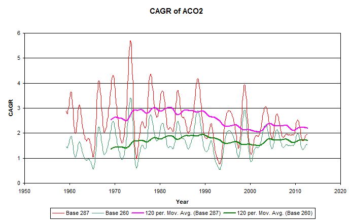
But what are the chances of CO2 stopping rising today? To answer this we need to look at CO2 in excess of the natural background level of 280 ppm, which we can call anthropogenic CO2 or ACO2.
During the past half century ACO2 would appear to be rising with a compound annual growth rate or CAGR of about 2%, with no sign at all of any change. In 2014 that excess was 120 ppm or about 0.94 Eg. Over 80 years that 2% CAGR amounts to a factor of 5. So unless that CAGR starts to reduce, by 2094 ACO2 will have increased by an additional 4.7 Eg, and nearly 5 Eg by 2100!
So if in 2100 ACO2 stopped at 5 Eg more than in 2014, and somehowever remained there for the rest of the millennium with no further increase, this is 6 Eg more than since preindustrial times. In the long run, many centuries later, much ice would have melted and the temperature would have slowly risen to a new equilibrium some 6*4 = 24 °F above preindustrial times. During that period Earth's inhabitants would see the seas rising until all the ice at the poles had melted.
You and I won't be around even at the start of that period, so why should we care?
This is one of those difficult existential questions. If during that millennium Earth is hit by a bigger asteroid than any experienced in the last billion years, maybe it wouldn't matter at all, even to our descendants.
Likewise if you think your crazy hot-rodding son is more likely to die in a car accident than of lung cancer, what would be the point of bugging him about his unhealthy chain-smoking habit?
These are not questions my training in physics and logic has qualified me to answer. I rather imagine even ethicists can't answer that sort of question.
Where did you get 6 degrees from?
The 6 degrees comes from the following two things.
CO2 rising from 280 ppm to 940 ppm is an increase of a factor of 940/280 = 3.357. This is equivalent to log22(3.357) = 1.75 doublings of CO2. If each doubling raises temperature by 3.3 °F, the total rise during the industrial era will have been 3.3*1.75 = 5.8 °F.
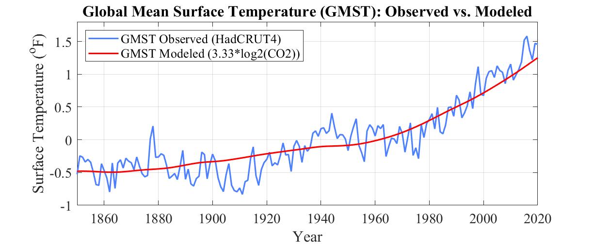
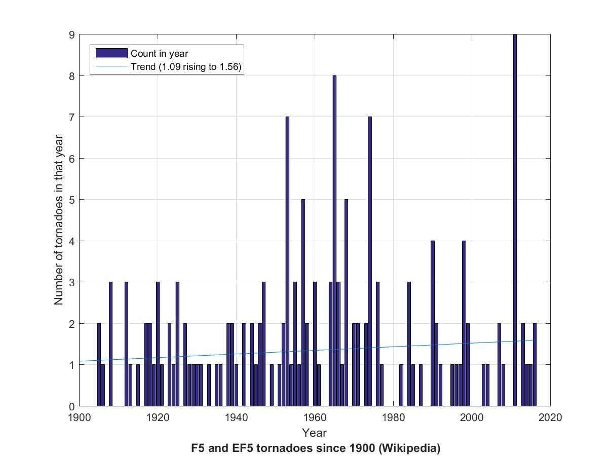
The Gathering Storm
The history of greenhouse gases begins with the Swiss physician, mountaineer, and experimentalist Horace de Saussure in the 1780s who demonstrated that the Sun heated the tops of mountains just as strongly as the bottoms.It continued with French mathematician and theorist Joseph Fourier in the 1810s who made the connection with heat-trapping glass.
Next came the Irish experimental physicist John Tyndall in the 1850s who showed that gases whose molecules had three or more atoms such as H2O and CO2 trapped infrared heat.
In 1896 Swedish chemist Svante Arrhenius conducted an experiment to measure the amount of heat from the Moon trapped by the atmosphere as a function of the length of its path through the atmosphere, and inferred a climate sensitivity of 4 or 5 degrees C per doubling of CO2.
In the 1930s British engineer Guy Callendar wrote extensively on the threat posed by growing CO2.
In 1958 American scientist Charles Keeling oversaw the installation of a observatory to measure atmospheric CO2 at 11,000 feet on Mauna Loa on Hawaii's Big Island.
And in 1987 a handful of governments who'd been wondering about the three decades of Keeling's measurements asked the World Meteorological Organization and the United Nations Environmental Programme whether they needed to worry about rising CO2.
In response the WMO and UNEP joined forces and in 1988 convened a number of scientists as the Intergovernmental Panel on Climate Change to summarize what was known to date about that possible threat. The IPCC did so in a report released in 1990 as its first Assessment Report.
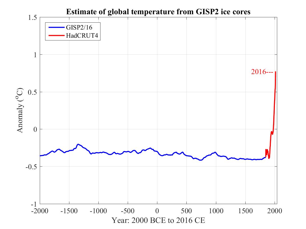
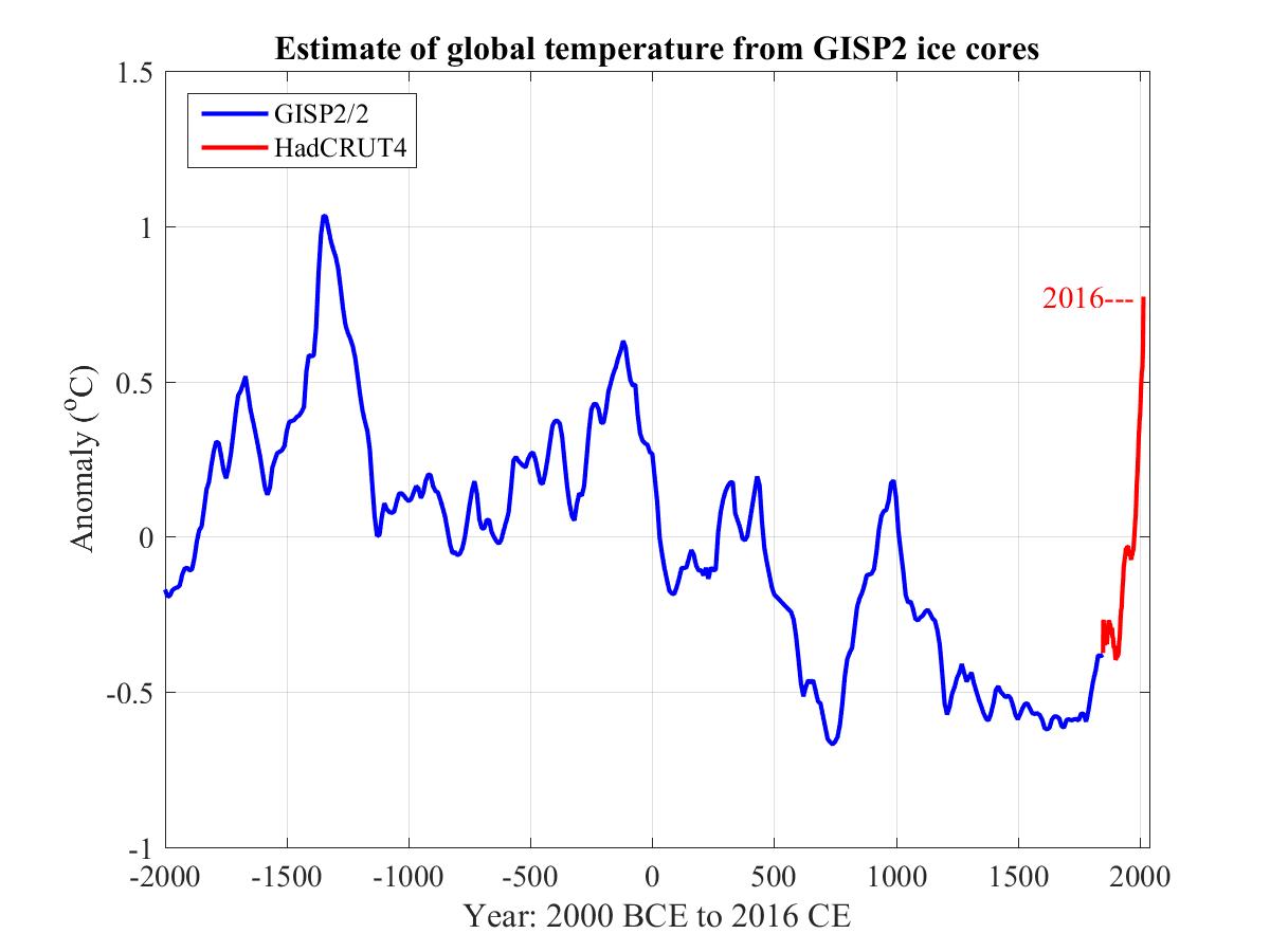
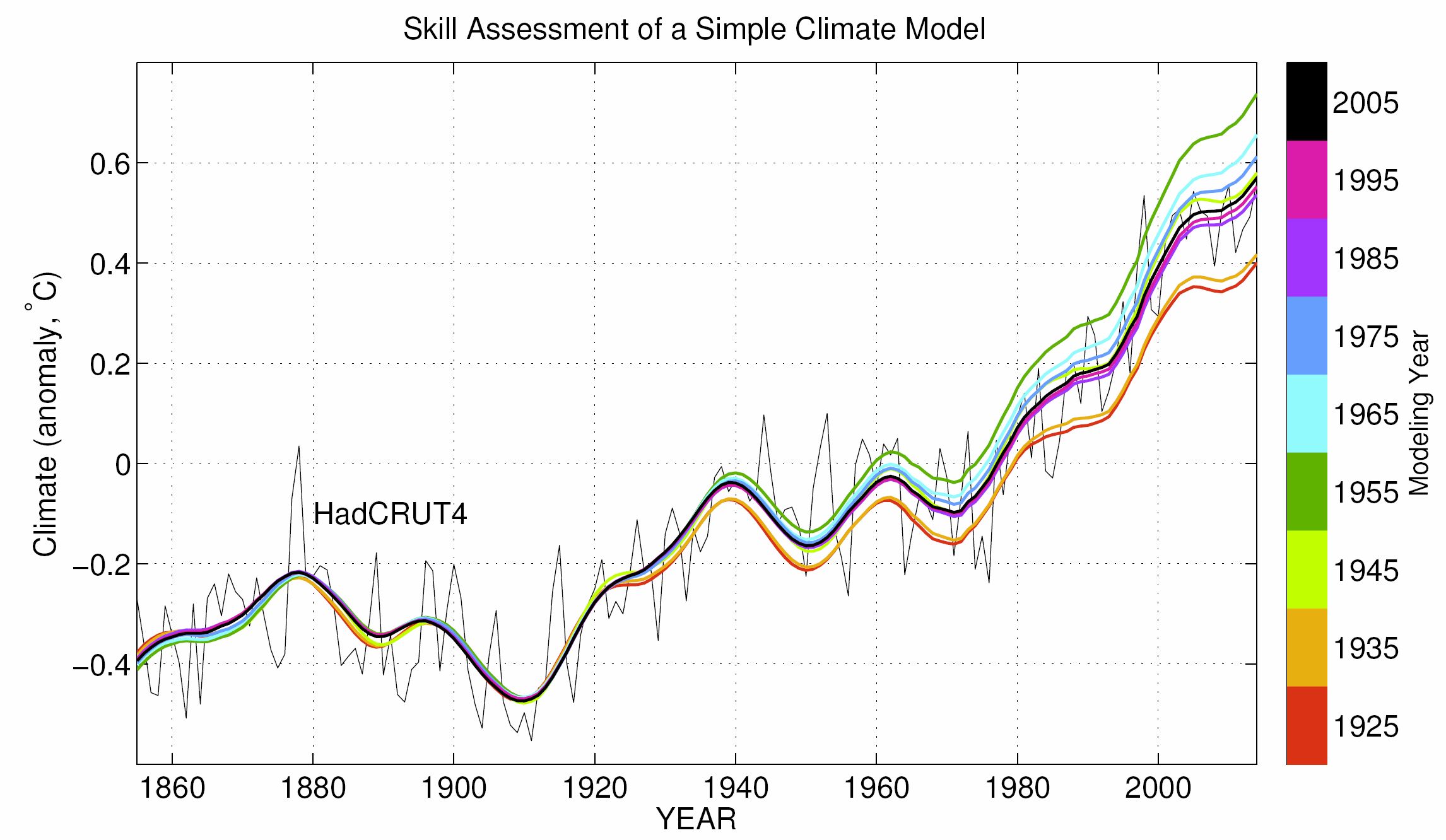
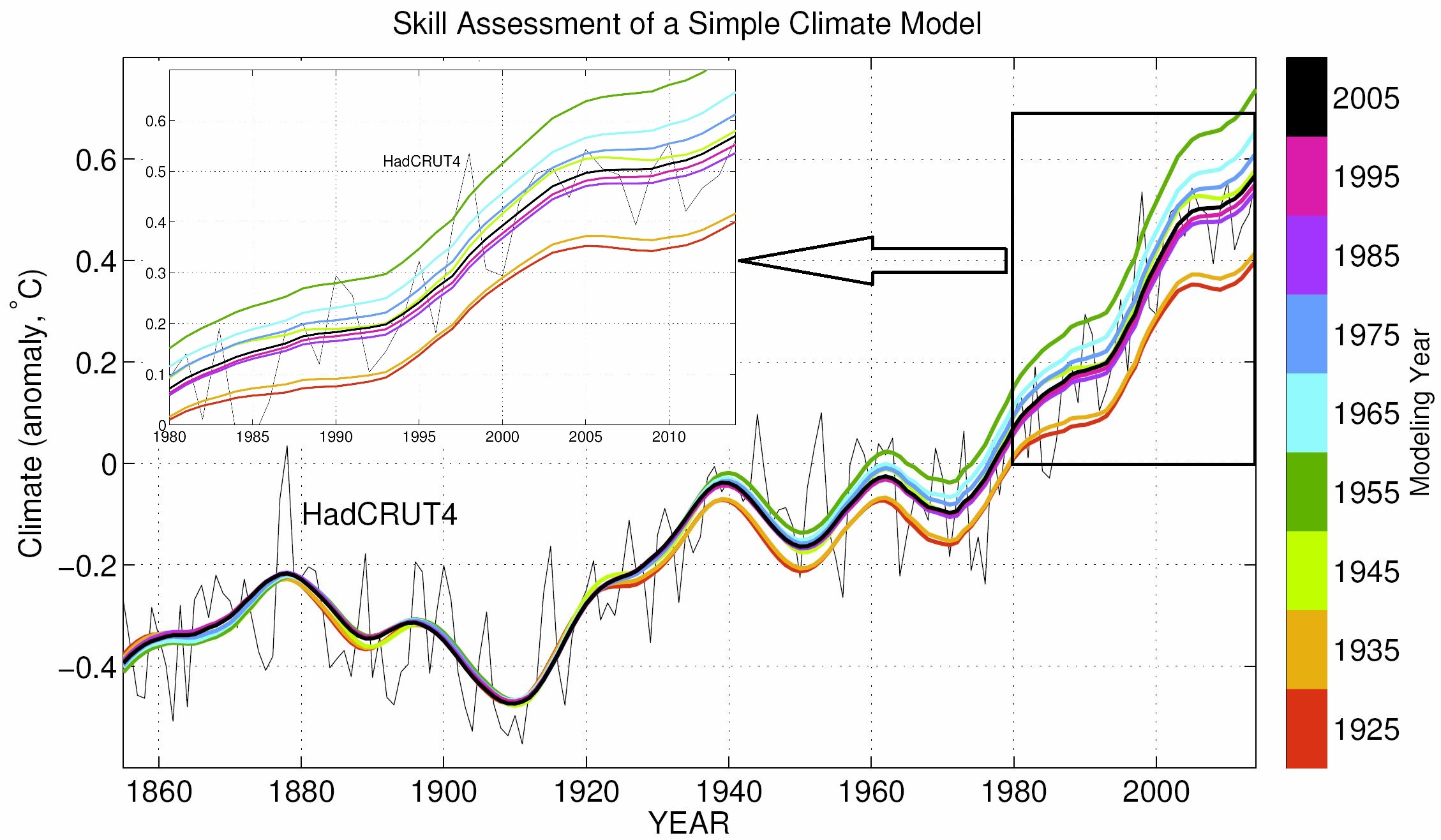
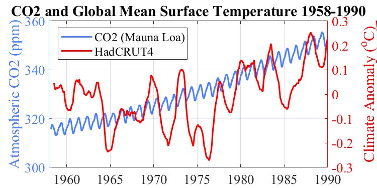
At the time the projections were primarily theoretical. The actual evidence for rising CO2 causing what the report's lead author referred to as global warming was very thin, as can be seen from the lack of correlation in this graph betwen Keeling's data on CO2 and the world's surface temperatures made on land and at sea.
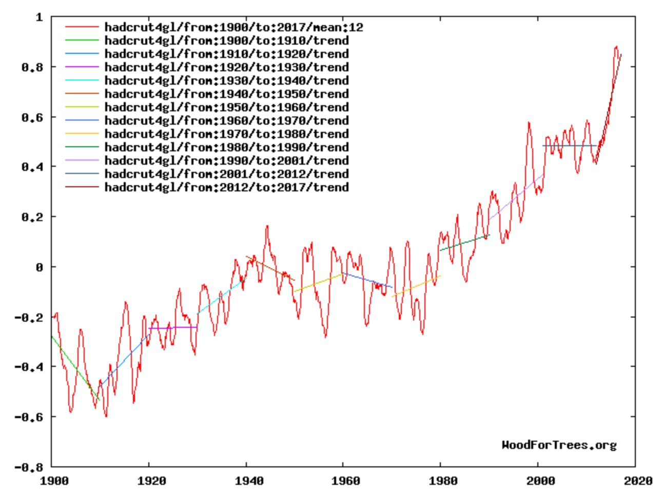
But every six years or so the IPCC would release another report, the Fifth Assessment Report or AR5 being released in 2013. By then surface temperature had started to rise. But then during 2002-2012 it came very close to plateauing, affectionately called The Hiatus and raising the possibility that surface temperature had risen about as far as it could and was about to return to its much colder 1970s levels.
Fast forward to 2020. During the decade following 2012 it became clear that, far from being peak heat, the hiatus was merely a temporary pause, as can be seen from this 30-year extension of the foregoing plot to 1990.
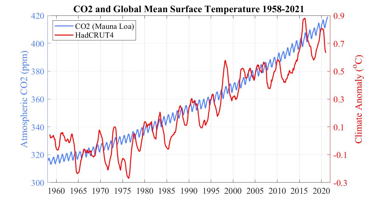
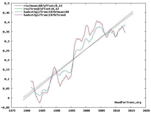
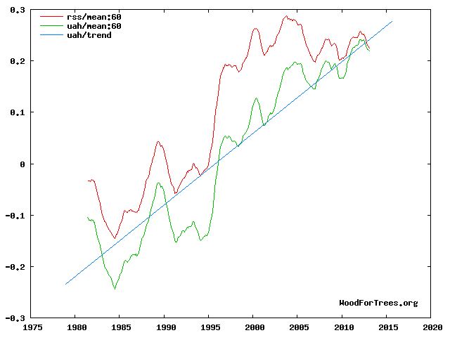
During 1958-2020, each 1 ppm rise in CO2 corresponds roughly to a 10 mK (millikelvin) rise in temperature. So a 1 °C rise in surface temperature corresponds to a 100 ppm rise in CO2, for example from 320 ppm to 420 ppm.
These two graphs show Celsius rather than Fahrenheit degrees on the right axis. The range from -0.4 to 1 °C corresponds to -0.72 to 1.8 °F.
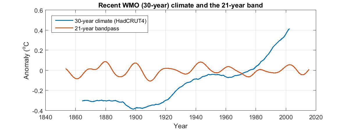
Recent climate as defined by the World Meteorological Organization
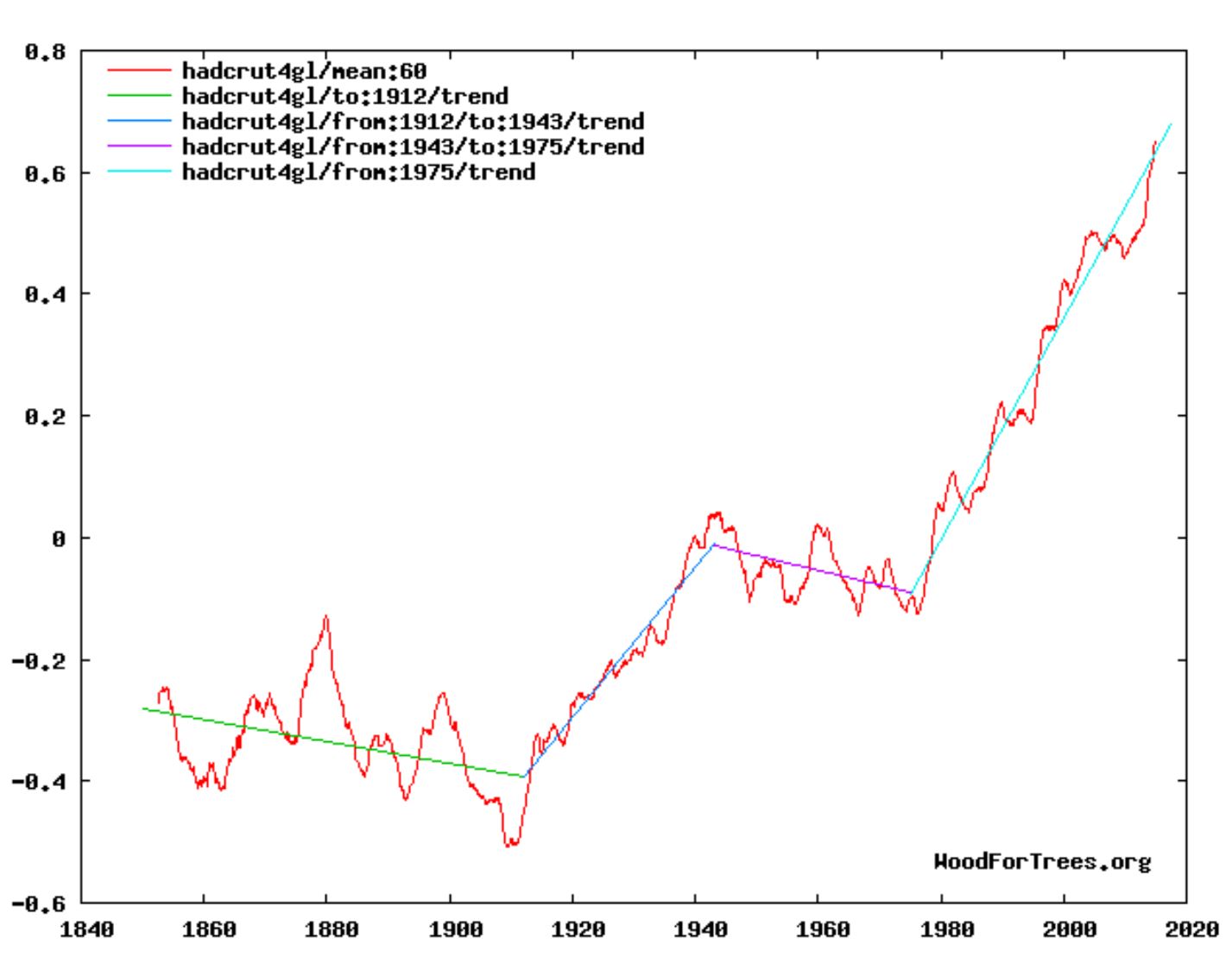
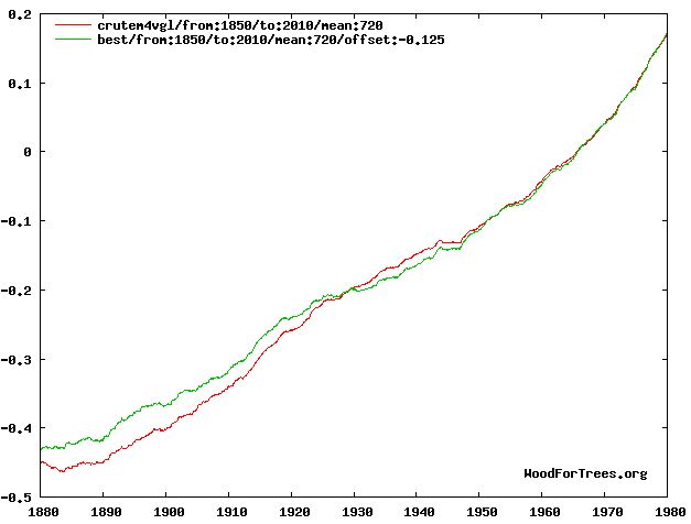
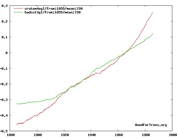
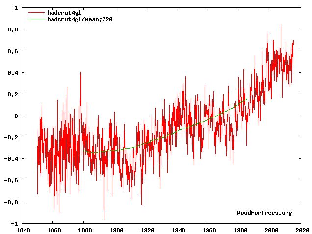
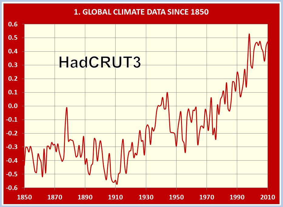
The blue curve in the following plot is HadCRUT4, global mean surface temperature (sea and land) since 1850.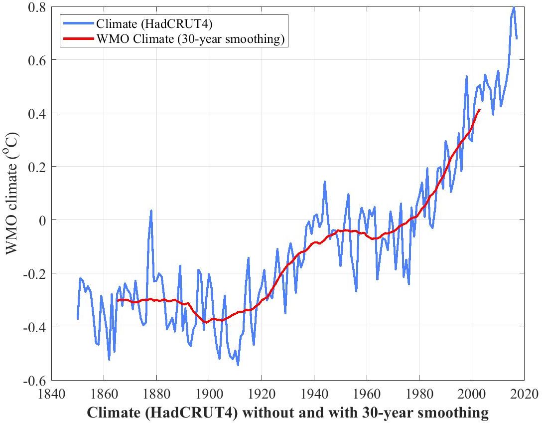
There would appear to be much randomness in this data, suggestive of chaotic influences in annual climate.
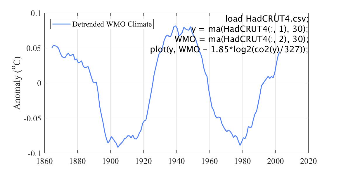
The red curve is the same thing but smoothed to a running mean or moving average of 30 years. This is the World Meteorological Organization's definition of "climate". It has the benefit of eliminating the chaotic influences on climate so as to expose the general trend.
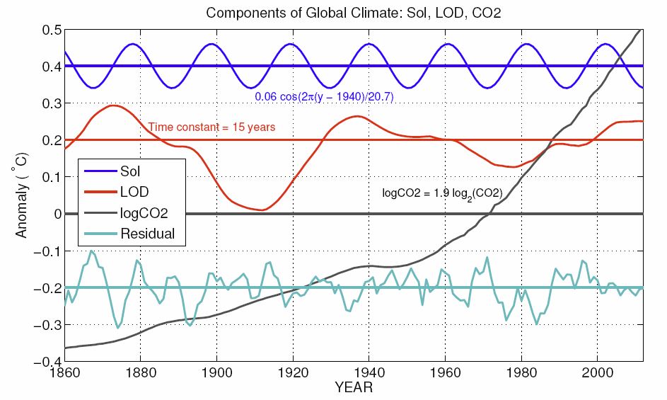
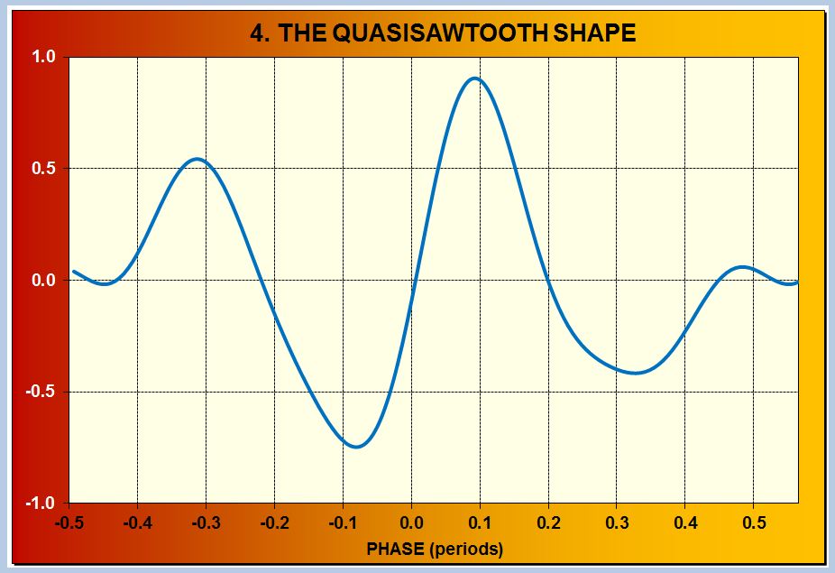
This trend has two evident components, a long-term exponential growth on which is superimposed an oscillation with a period of some 60 to 70 years.
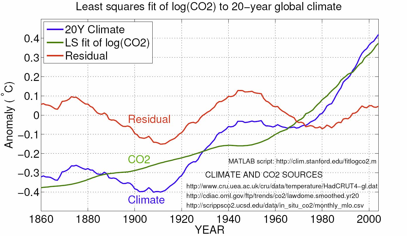
Detrended WMO climate is WMO climate detrended by the expected influence of CO2 from WMO climate, as shown in this plot.
1.5 CO2 between 1 CE (the year after 1 BC) and 1900 CE
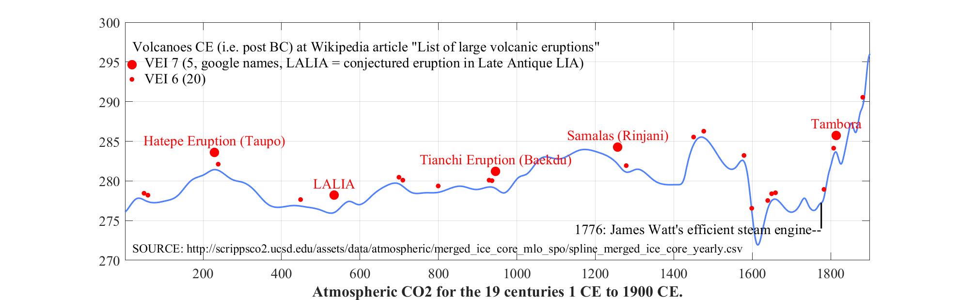
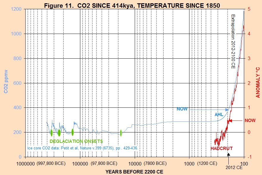
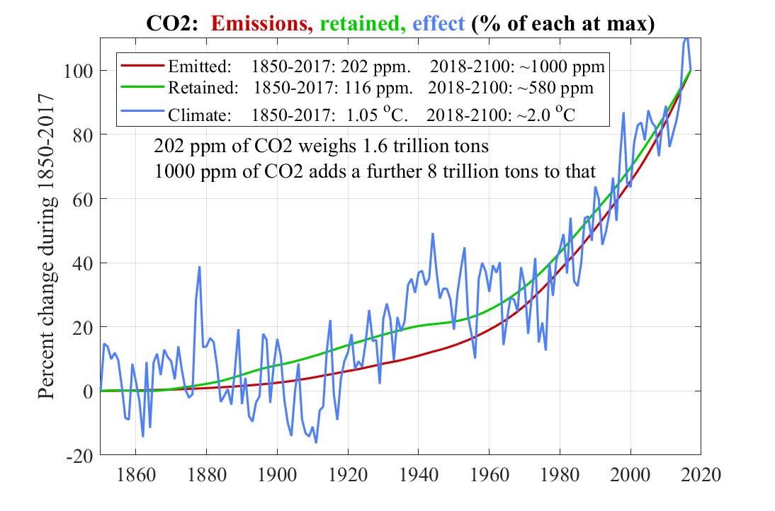
It is very clear that CO2 emissions are getting more and more out of hand.
2. The CO2 "hockey stick" since 1000 CE
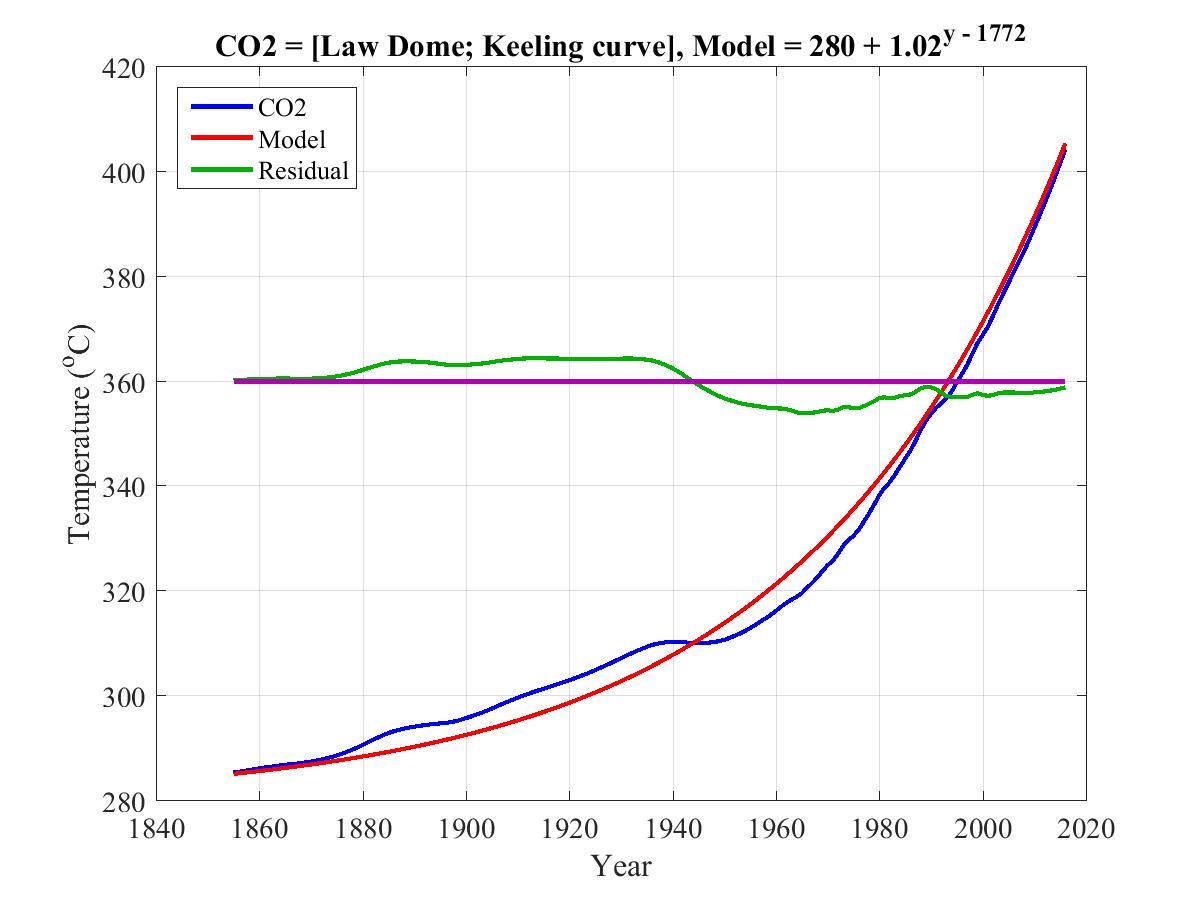
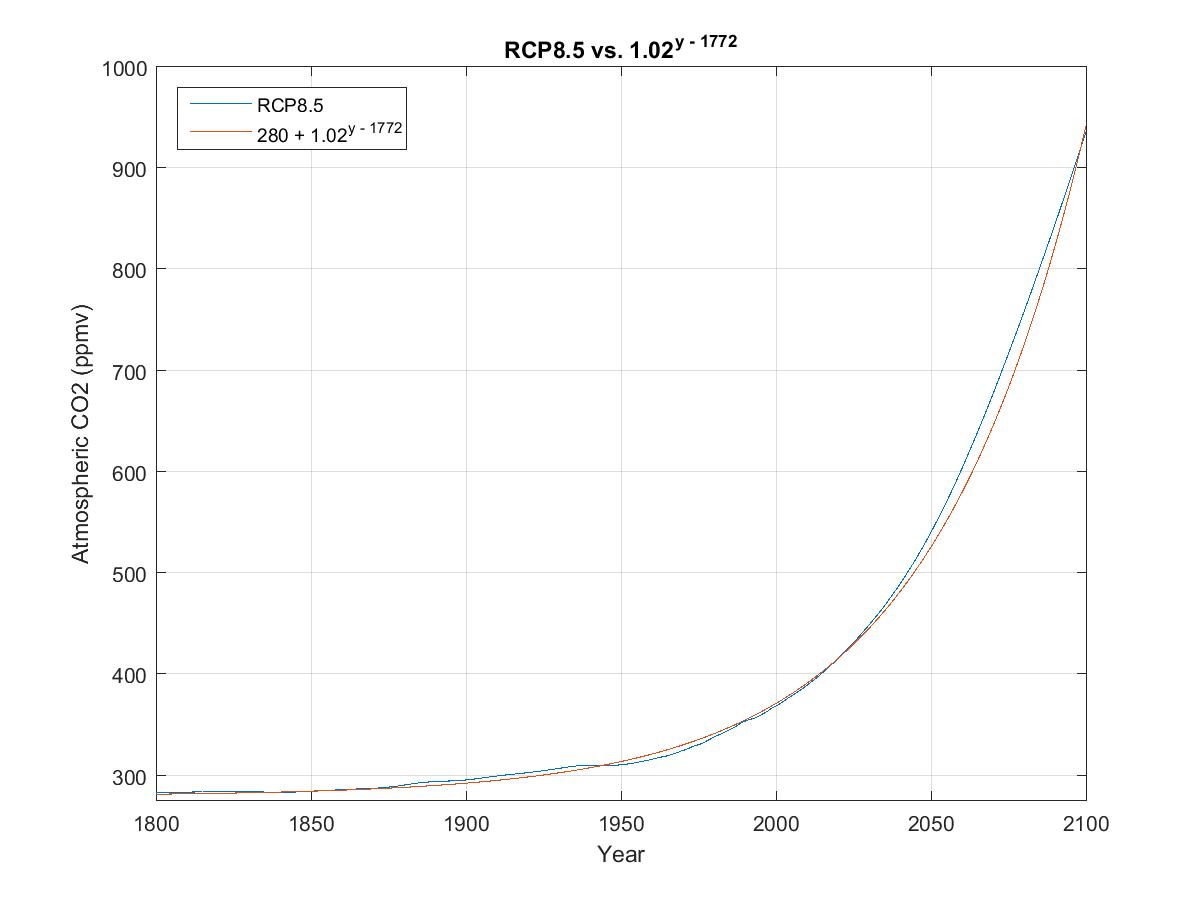
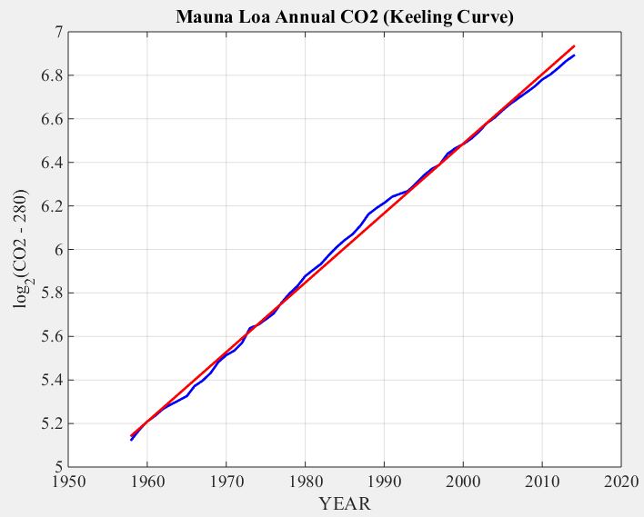
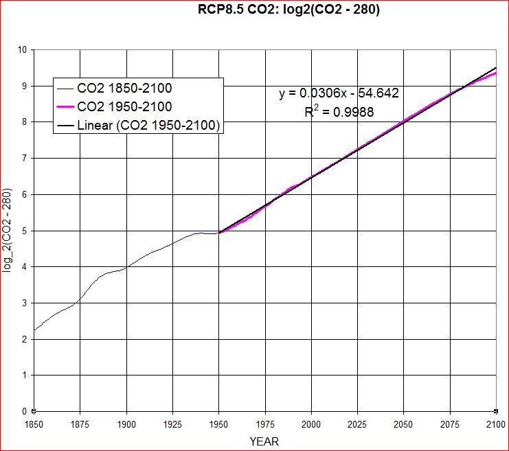
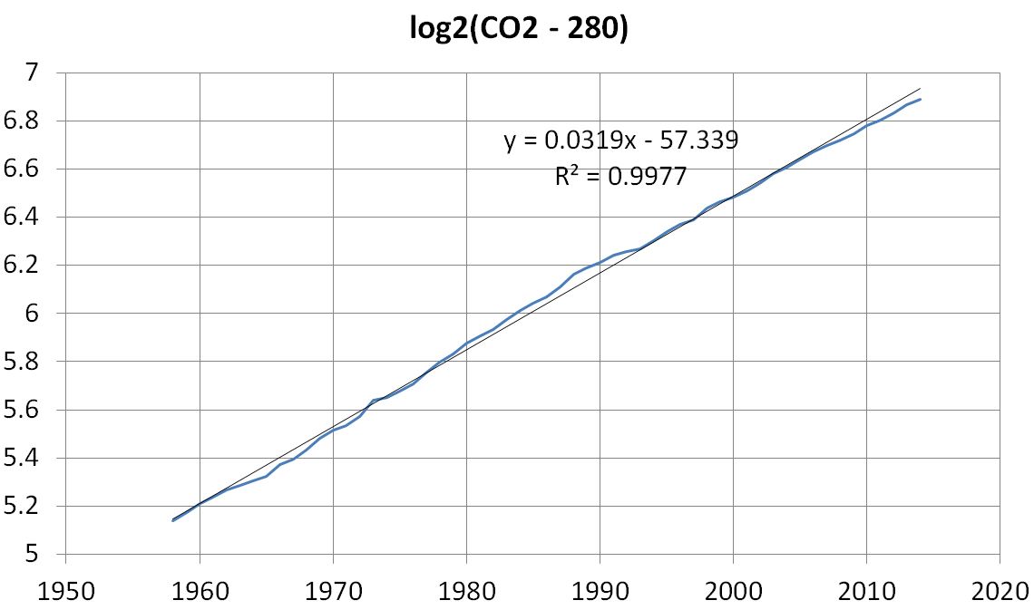
The following two plots demonstrate that rising CO2 can be modeled to within 5 ppm as 280 ppm plus an exponential compounding annually at 2% (CAGR = 2%). The thin dark blue line in the first plot gives observed atmospheric CO2 as measured in Antarctic ice cores for pre-1958 atmosphere and more directly at the Mauna Loa CO2 observatory since 1958.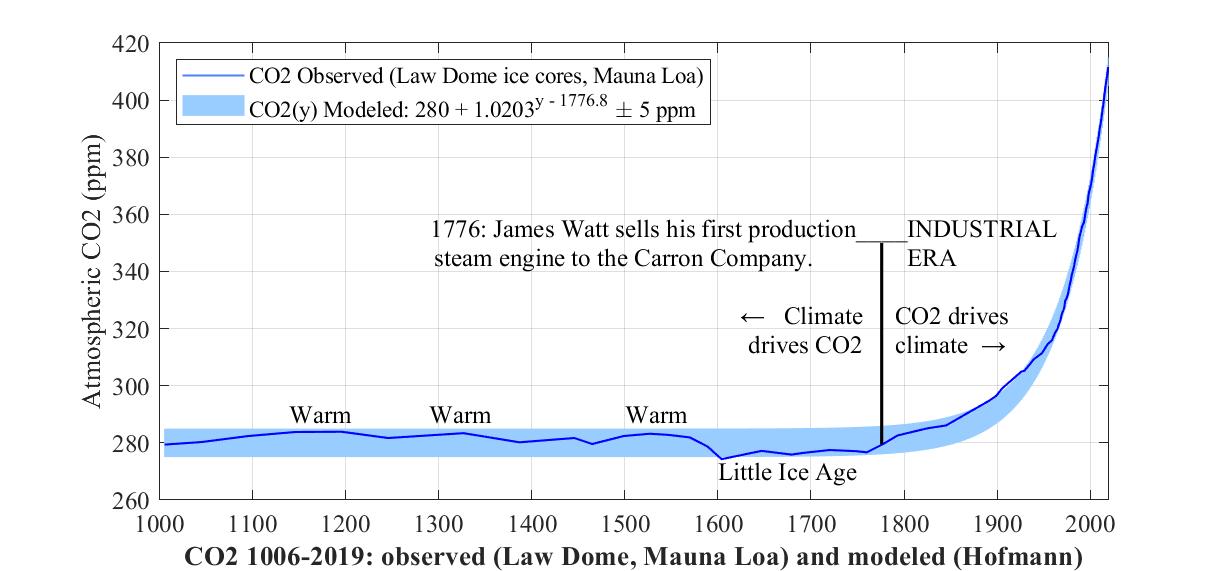
Now if we subtract 280, take the log base 2 of the exponential, and zoom in to the top right corner of the above graph, and plot monthly rather than annual CO2, we observe the following remarkable fit of the 2.03% model to the observed level of rising CO2.
3. Impact of CO2 emissions
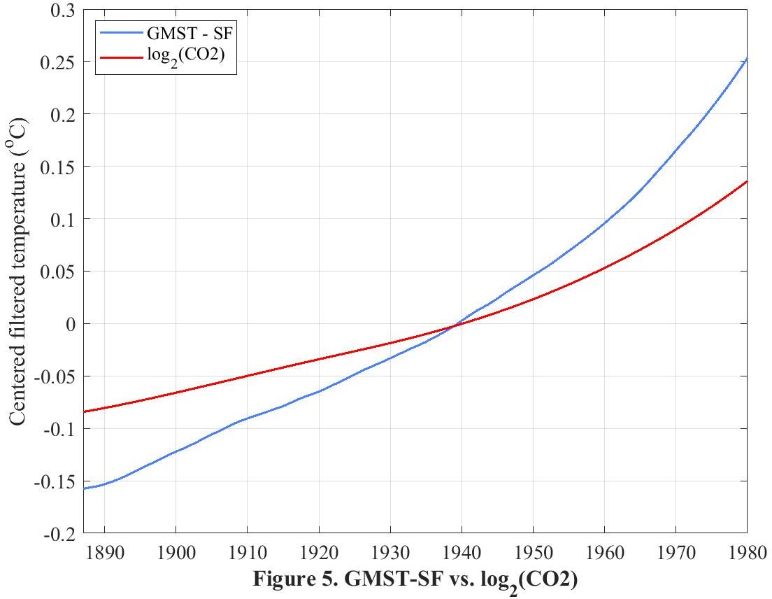
This graph for the period 1851-2019 plots greenhouse gases (the blue curve) and land temperature in degrees Fahrenheit (the red curve) as they rise from 15.1 to 16.1 Eg and from -1 °F to 2 °F respectively.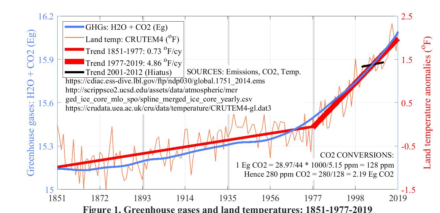
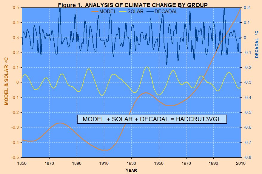
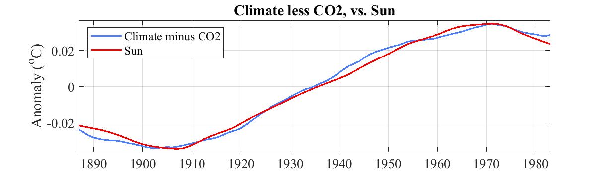
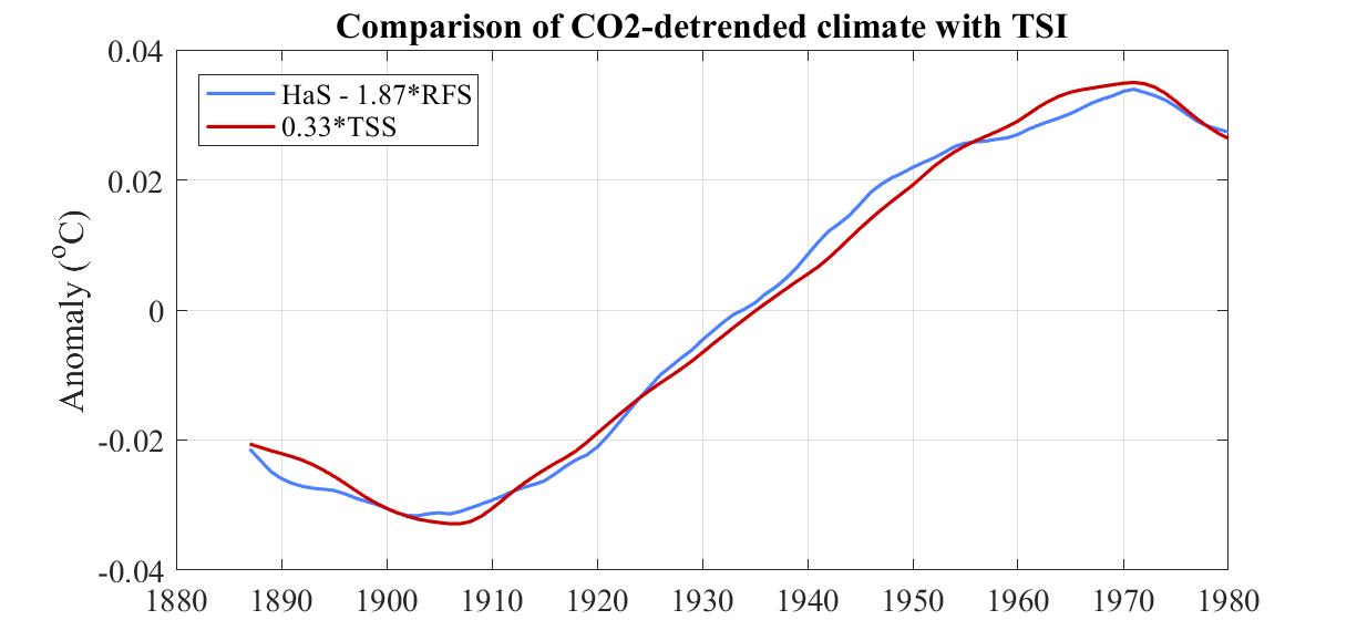
4. Attribution of detrended long-term climate to the Sun
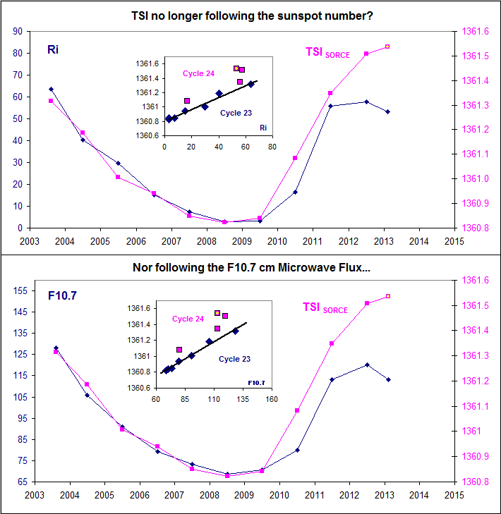
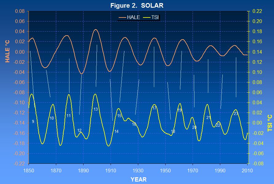
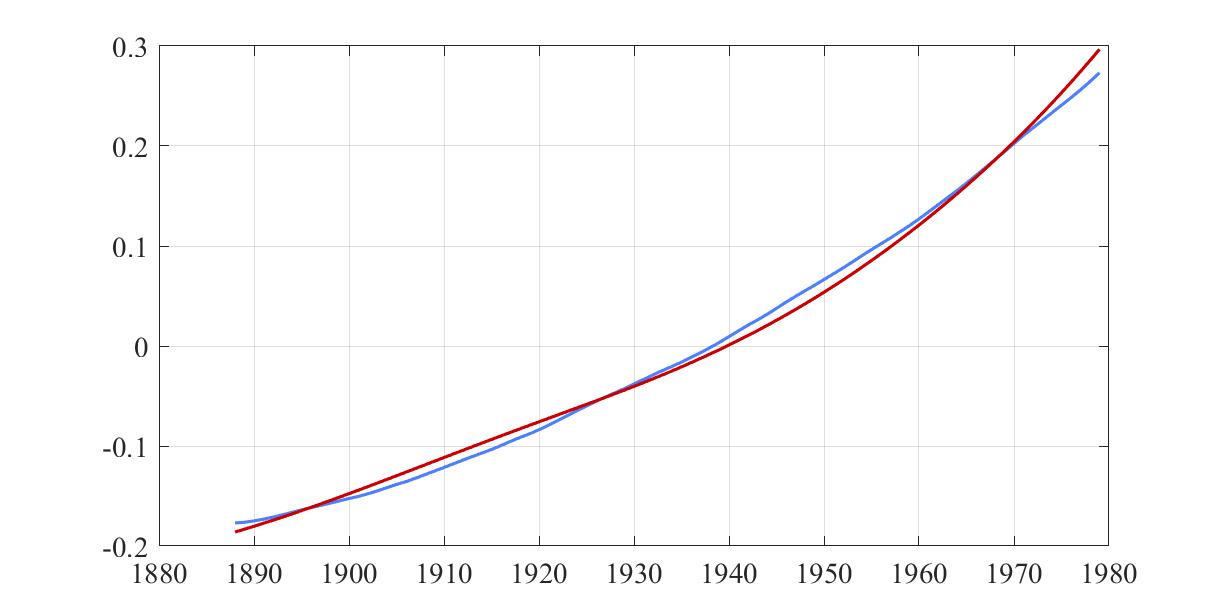
The two curves in the following graph show an excellent correlation between detrended long-term climate as represented by annual HadCRUT4 and long-term Sun as represented by a recent reconstruction of historical Total Solar Irradiance (TSI).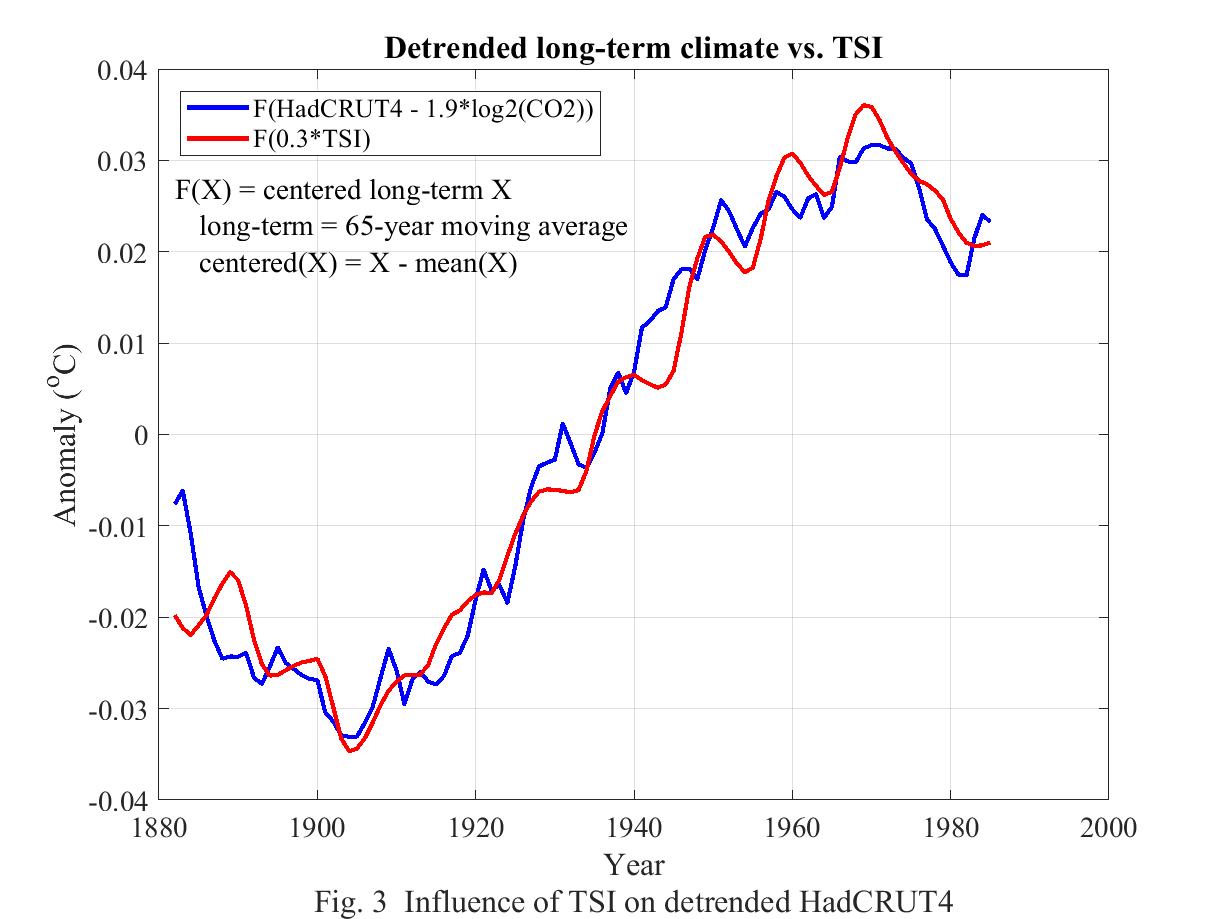
After loading the data for annual HadCRUT4, CO2, and TSI, all for the period 1850-2017, MATLAB then plotted the blue and red curves with the following one-line MATLAB command. plot(1882:1985, [F(HadCRUT4 - 1.85*log2(.003*CO2)) F(0.3*TSI)])
A few additional lines annoted the graph and defined the function F(X) which smooths X to a 65-year moving average and then centers the result by subtracting its mean in order to align the curves vertically.
The main points are as follows.
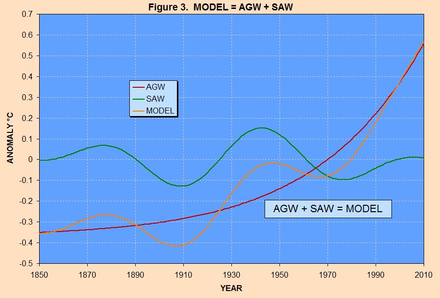
Instead of subtracting radiating forcing from HadCRUT4 we can subtract solar forcing and call this Anthropogenic Global Warming. Comparing this with radiative forcing reveals the same tight correlation.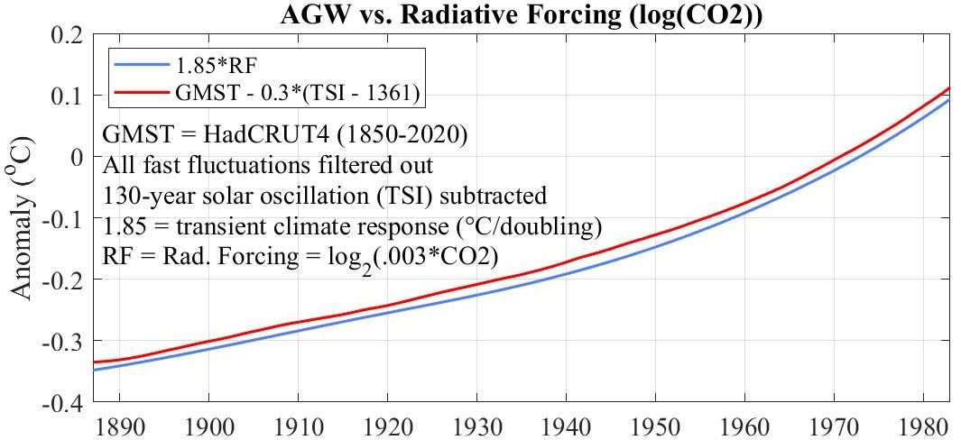
MANY MANY PICTURES
(Only the first few annotated)
(Only the first few annotated)
-4. Residual surface temperature compared with human radiative forcing
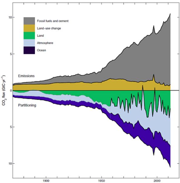
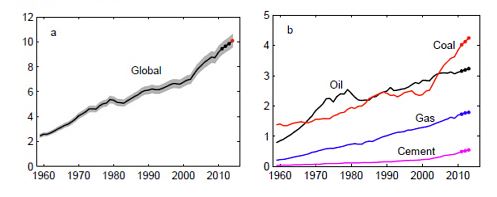
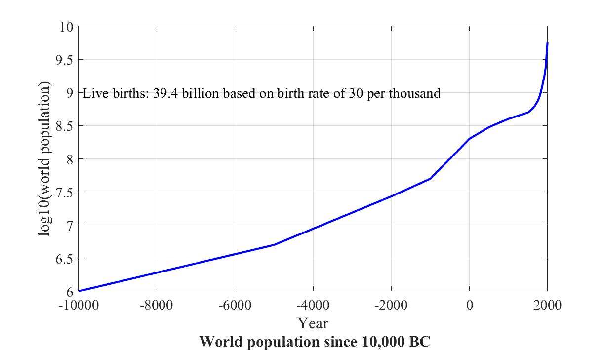
Since 1800 global population has increased seven-fold, compounded by an even greater rise in per capita energy consumption.There is an evident correlation between the seven-fold rise in each of global population and technology over the past two centuries and the atmospheric CO2 "hockey stick", suggesting that humans are the cause of the latter, which in turn could be the cause of the one-degree rise in global climate over that period.
A straightforward way to see the connection is by plotting rising atmospheric CO2 against emitted CO2 since 1900, as follows.
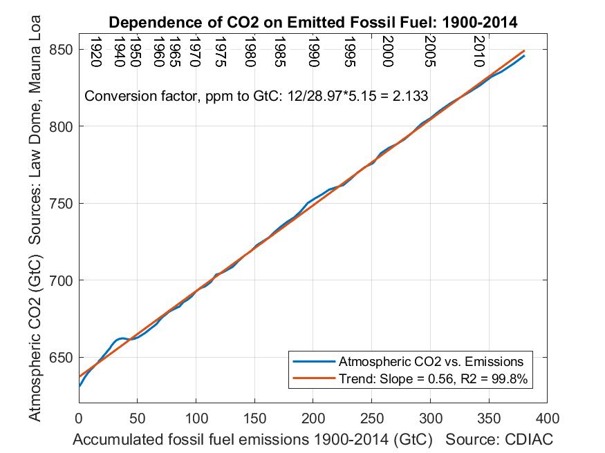
This shows that each petagram (billion tons) of emitted CO2 has increased the mass of CO2 in the atmosphere by 0.56 petagrams. Equivalently, each PgC (petagram of carbon) has raised atmospheric carbon by 0.56 PgC--just multiply both figures by 12/44.
The following plots the actual rise in temperature against the rise that would be expected if instead of 0.56 PgC we used 0.45 PgC, which unlike the 0.56 factor takes land use changes into account. The y-axis is HadCRUT4 filtered with an 11-year moving average filter to remove the solar cycle's influence and detrended by other natural influences.

The graph plots RST against Human Radiative Forcing defined as follows. One benefit of correlating temperature with emitted CO2 rather than measured atmospheric CO2 is that it makes natural sources of recently rising CO2 irrelevant to the question of whether humans are responsible for rising temperature. The above graph is strong evidence that they are.
-2. CO2 vs. Methane
The 20-year global warming potential of methane is 86, meaning that averaged over 20 years 1 part per million by mass has the same global warming potential as 86 parts per million by mass of CO2.Atmospheric concentrations are however given not by mass, ppmm, but by volume, ppmv. The respective masses of a mole of CO2 and a mole of CH4 are 44 and 16. while the mass of an average mole of atmosphere is 28.97. Hence 1 ppmm of CH4 is therefore 28.97/16 = 1.81 ppmv while 86 ppmm of CO2 is 86*28.97/44 = 56.6 ppmv. Hence when comparing CO2 and CH4 when their concentrations are given by volume, the global warming potential of CH4 is only 56.6/1.81 = 31 relative to CO2.
Based on that factor of 31, the following graph compares the global warming potentials of CO2 and methane (CH4) since 1860. Each is given first as a model whose anthropogenic component is growing at 2% a year, and then its actual values.
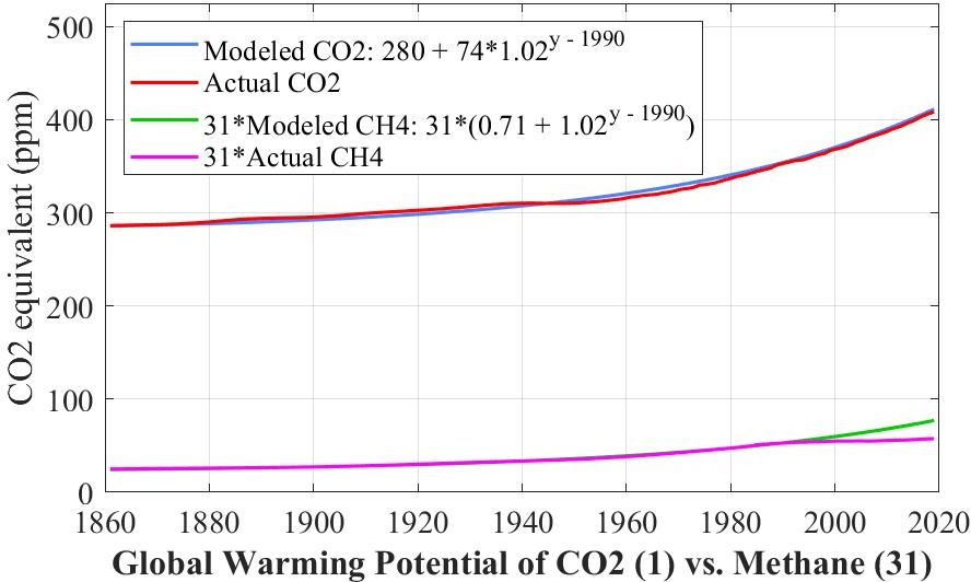
What we need today is for ACO2 to slow down the way ACH4 did after 1990.
There is one further difference between CO2 and CH4. Whereas CO2 does not decompose, CH4 decomposes into CO2 and H2O. The 100-year GWP of CH4 by mass is down to 25 while its 500-year GWP is a mere 7.6. By volume these two GWPs reduce to 9.1 and 2.8 respectively.
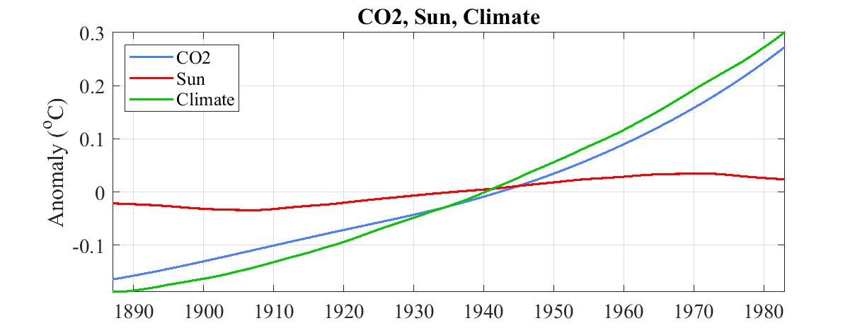
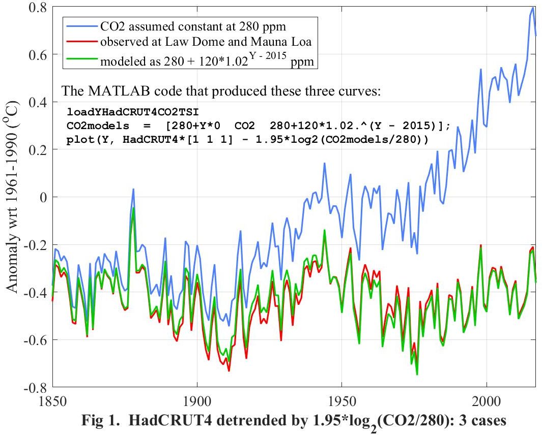
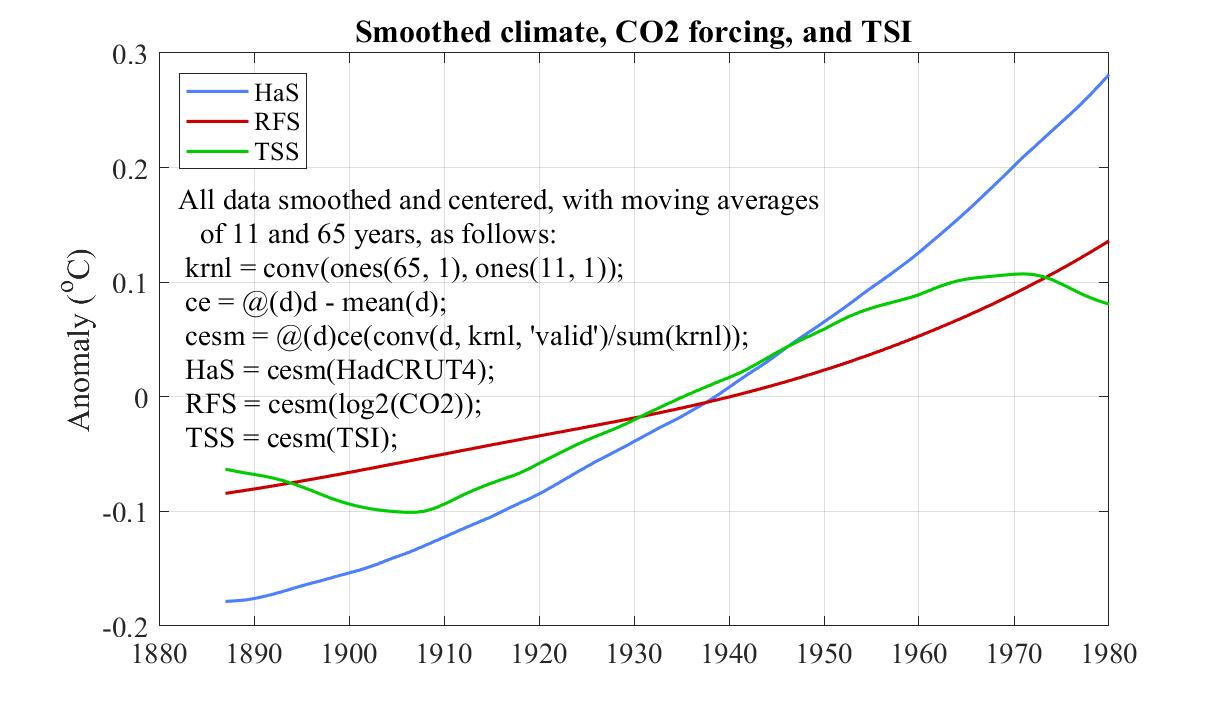
-1. The main fingerprint of CO2 on global climate
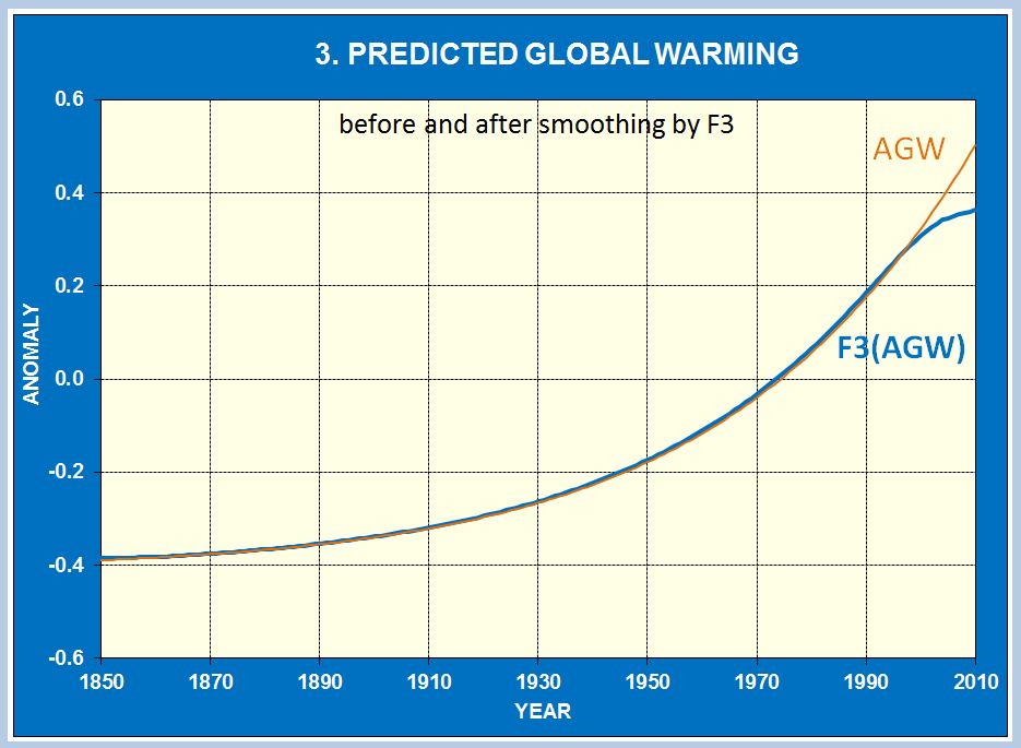
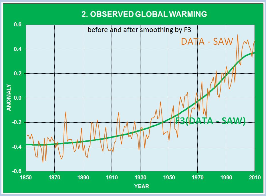
The following figure plots three curves. The first (blue) curve is HadCRUT4 itself, with the assumption that CO2 is not involved. If so, how would you explain a rise not seen for thousands of years?The second (red) curve is what HadCRUT4 would have recorded if CO2 had not rised as recorded.
The third (green) curve is what HadCRUT4 would have recorded if CO2 had not rised as modeled.
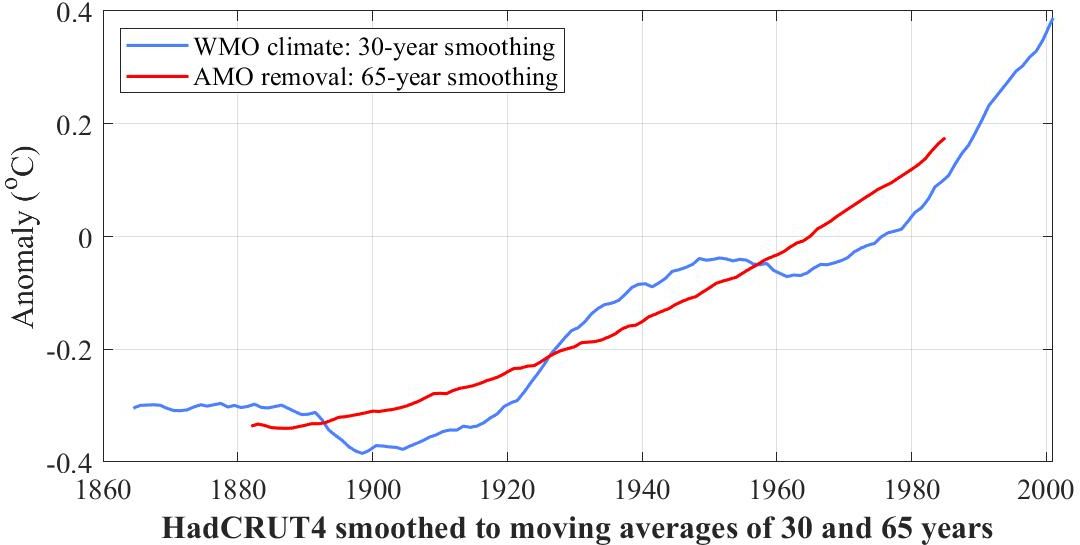
0. Direct observation of the Sun's influence on centennial climate
We take climate to be global HadCRUT4 since 1850. By that definition climate is always changing, and furthermore very quickly.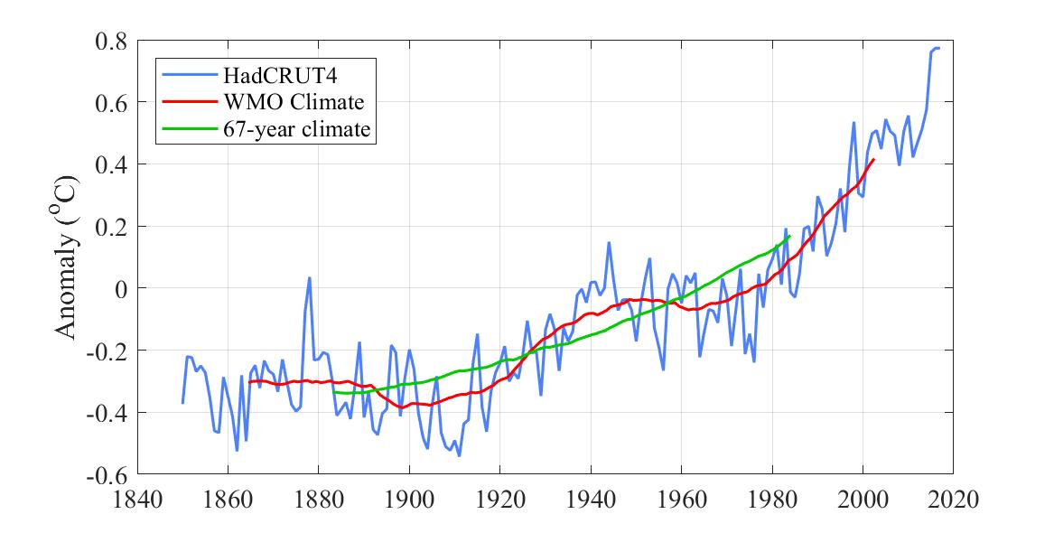
 /center>
If we average climate over 65 years however (red curve in that figure),
climate is still changing, though only up, not down.
/center>
If we average climate over 65 years however (red curve in that figure),
climate is still changing, though only up, not down.
However the Sun remains constant to within 0.1%.
One would therefore not expect to be able to directly observe the influence of the Sun on climate. It is therefore surprising that its influence can be seen in the green and magenta curves in the middle of the following graph.
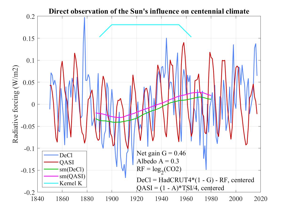
The absorbed portion of TSI is (1 - A)*TSI, being the portion of TSI not reflected straight back to space as outgoing shortwave radiation. ASI is what heats Earth's atmosphere and surface. The red curve labeled QASI is one quarter of ASI and is the flux density of heat escaping to space, averaged over Earth's surface, that would exactly offset ASI. The factor of four is the ratio of Earth's surface (as a sphere of surface area 4πr²) to Earth's cross section (as a disc of area πr² as seen from the Sun).
To align DeCl and QASI vertically we center both by subtracting their respective means.
The evident fluctuations in both DeCl and QASI make it impossible to see any relationship between them. We can eliminate the faster fluctuations with a low-pass filter designed to pass only those fluctuations significantly slower than a period of 65 years. To this end we apply a moving-average or boxcar filter with a 65-year window. For additional calming of much shorter periods due to the solar cycle we also apply an 11-year moving average filter.
Each of these can be accomplished by convolving DeCl and QASI with "boxcars" of respective widths 65 and 11 years. By associativity and commutativity of convolution it suffices to convolve the two boxcars first, giving the light blue curve labeled Kernel K, a trapezoidal convolution kernel in place of the box-shaped one used for moving-average filtering. We can then smooth DeCl and QASI by convolving with K and extracting the "valid" portion, yielding respectively the green curve labeled sm(DeCl) and the magenta curve labeled sm(QASI).
Smoothing does not preserve centering, which is a good thing because the two smoothed curves don't obscure each other yet can clearly be seen to be almost identical to within a small vertical shift (an additive constant).
Since the resulting shape of both curves is roughly that of a 130-year cycle, twice the period of the 65-year cycle, the 65-year filter will attenuate the 130-year cycle by a factor of sinc(65/130) = 0.637. We therefore divide both curves by sinc(65/130) to offset this attenuation, thereby representing the two curves more accurately. Since sinc(11/130) = 0.988, taking that into account too would make a negligible difference so we haven't bothered to take the 11-year moving-average filter into account.
Could the gain G be as low as 0.44 or as high as 0.48? The following graph answers this by plotting DeCL against QASI (all smoothed, centered, and divided by sinc(65/130)) for all three values of G shown in the legend.
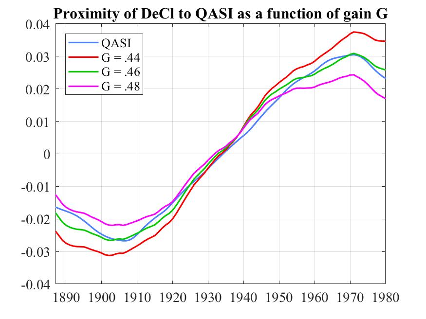
There has been much speculation about delays between instantaneous fluctuations in radiation and warming response. What is completely unexpected in this graph is the lack of any noticeable delay between the impact of the 130-year cycle in QASI and its counterpart in detrended HadCRUT4. Unless we are overlooking some simple explanation, this lack of visible delay seems like a great research topic.
5. The need to include the Sun in estimating climate sensitivity.
A common argument against CO2 as a major contributor to global warming is that climate, understood as the HadCRUT4 record of combined land and sea temperature since 1850, has not increase steadily the way CO2 does, but fluctuates seemingly at random. These fluctuations have no obvious human cause and are therefore likely to be of natural origin.
Prior to about 1980 the expected impact of CO2 has been small compared to these presumed natural fluctuations. We have found empirically that these fluctuations can be largely removed from HadCRUT by filtering with a 65-year moving average or boxcar filter, yielding the thin blue curve in the following figure.
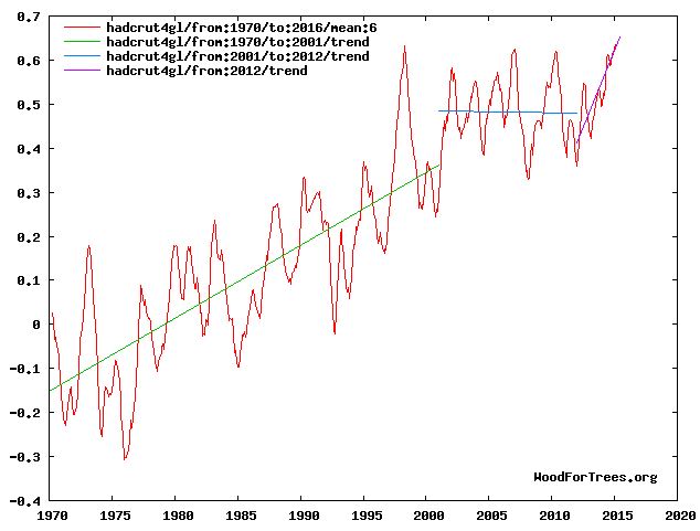
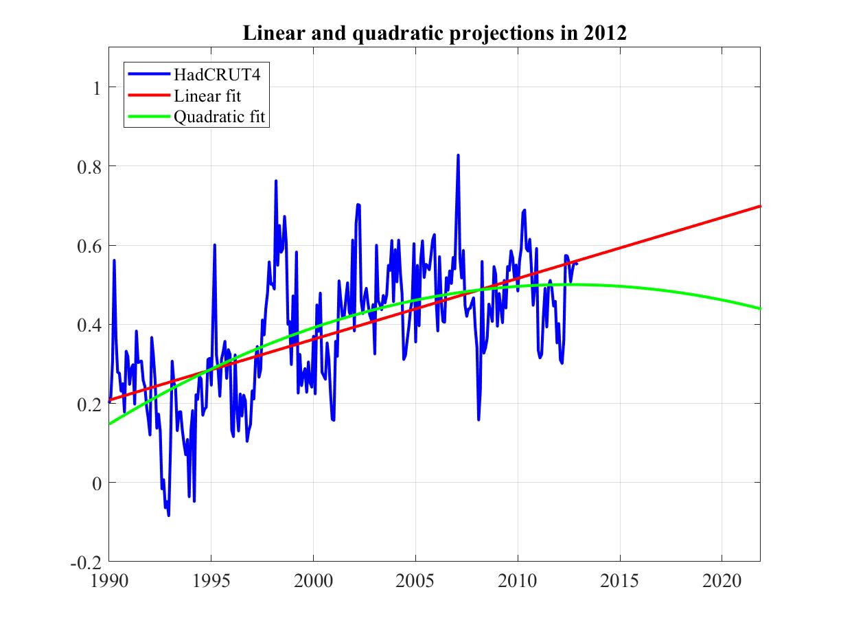
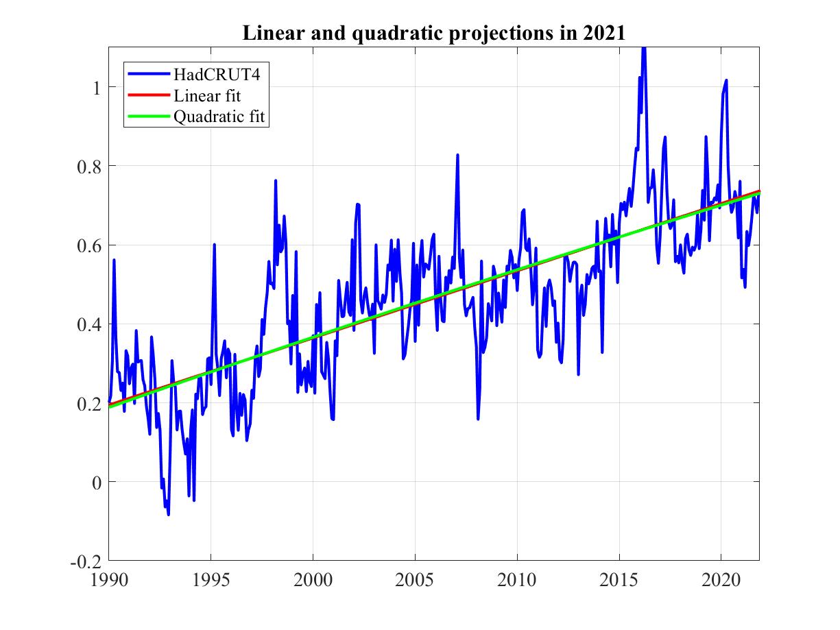
6. The hiatus in 2012 and now.
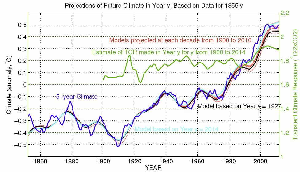
The following graph shows monthly HadCRUT4 since 1990, in blue up to 2012 and in purple to the end of 2017. Based on the data available at the time, it forecasts future climate in respectively 2012 (thin) and now (thick) based on two trend models, respectively linear (red) and parabolic (green).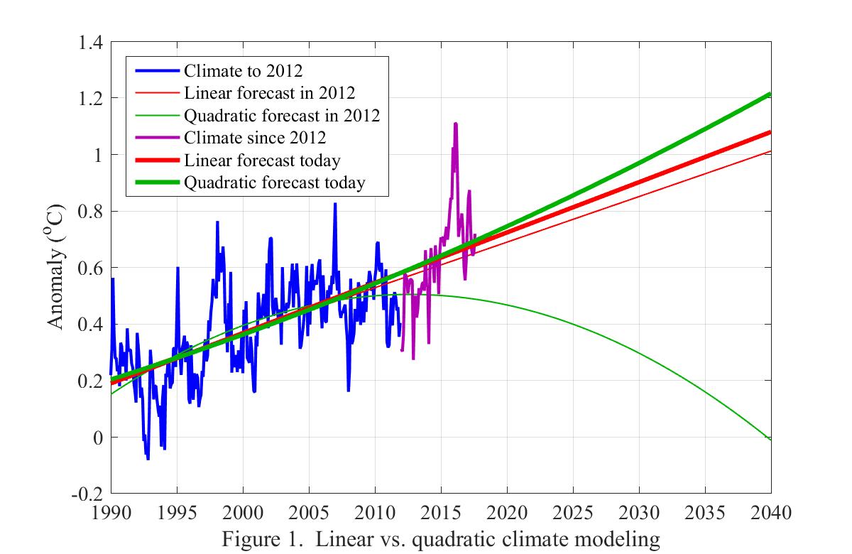
Five years later the linear trend model's forecast had barely changed. The parabolic model on the other hand had so completely changed its forecast as to end up on the other side of the linear trend model!
One conclusion might be that linear models predict more robustly than nonlinear. Given this, another conclusion might be that climate deniers attach little importance to robustness in choosing between models.
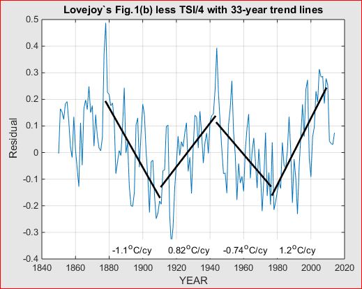
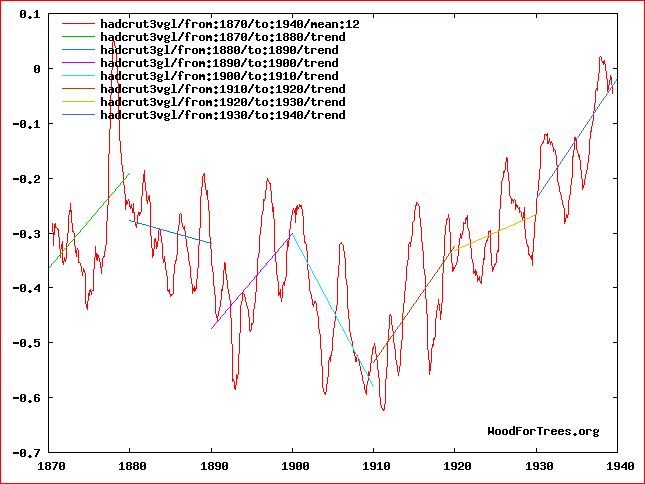
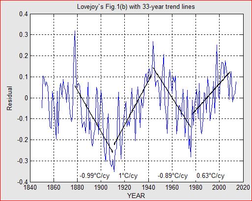
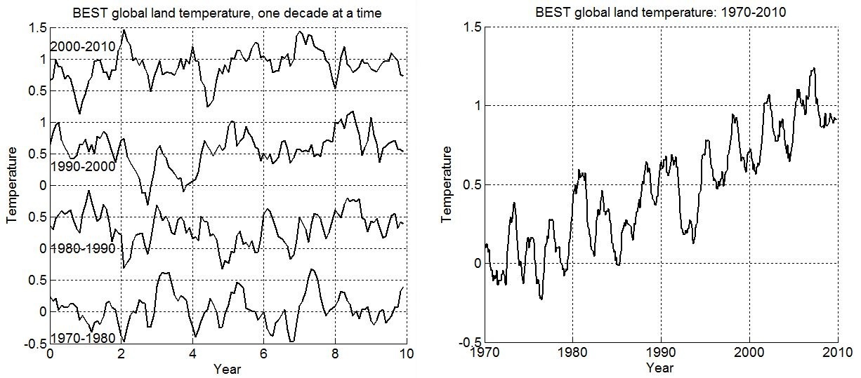
So why did the hiatus happen when CO2 was rising? To answer this I detrended HadCRUT4 by the expected warming due to rising CO2 and also by the so-called Atlantic Multidecadal Oscillation. The resulting plot of climate (the red curve in the figure below) still looked pretty random.
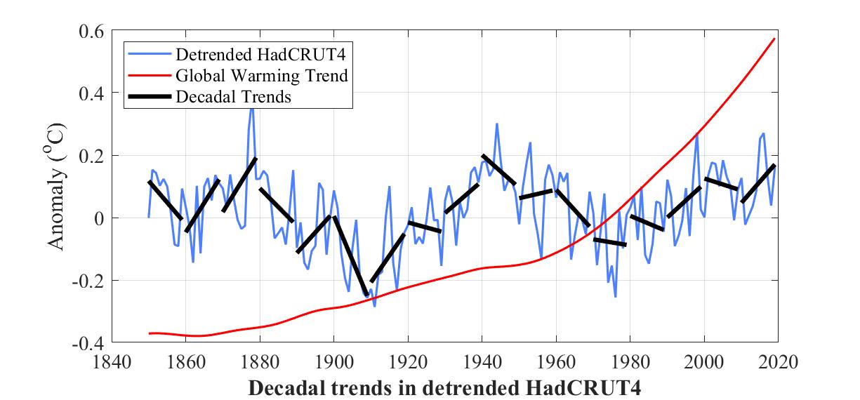
But then I fitted a trend line to each of the 15 decades since 1870. With the exception of the decade 1970-1980, every odd-numbered decade trended up and every even-numbered decade trended down.
One would therefore expect that the even-numbered decade 2000-2010 would trend down. But that's in the absence of global warming. What global warming did was cancel the even-numbered down-trend.
One would then expect that the uptrend for the odd-numbered decade 2010-2019 would add to global warming.
Which is what all the papers have been reporting during this decade: every year hotter than the one before, and hotter than any year in recorded history!
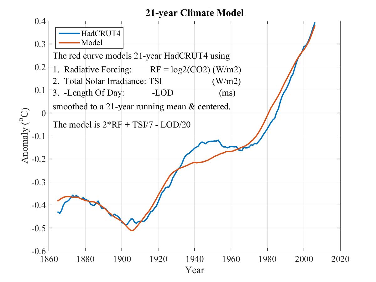
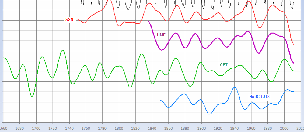
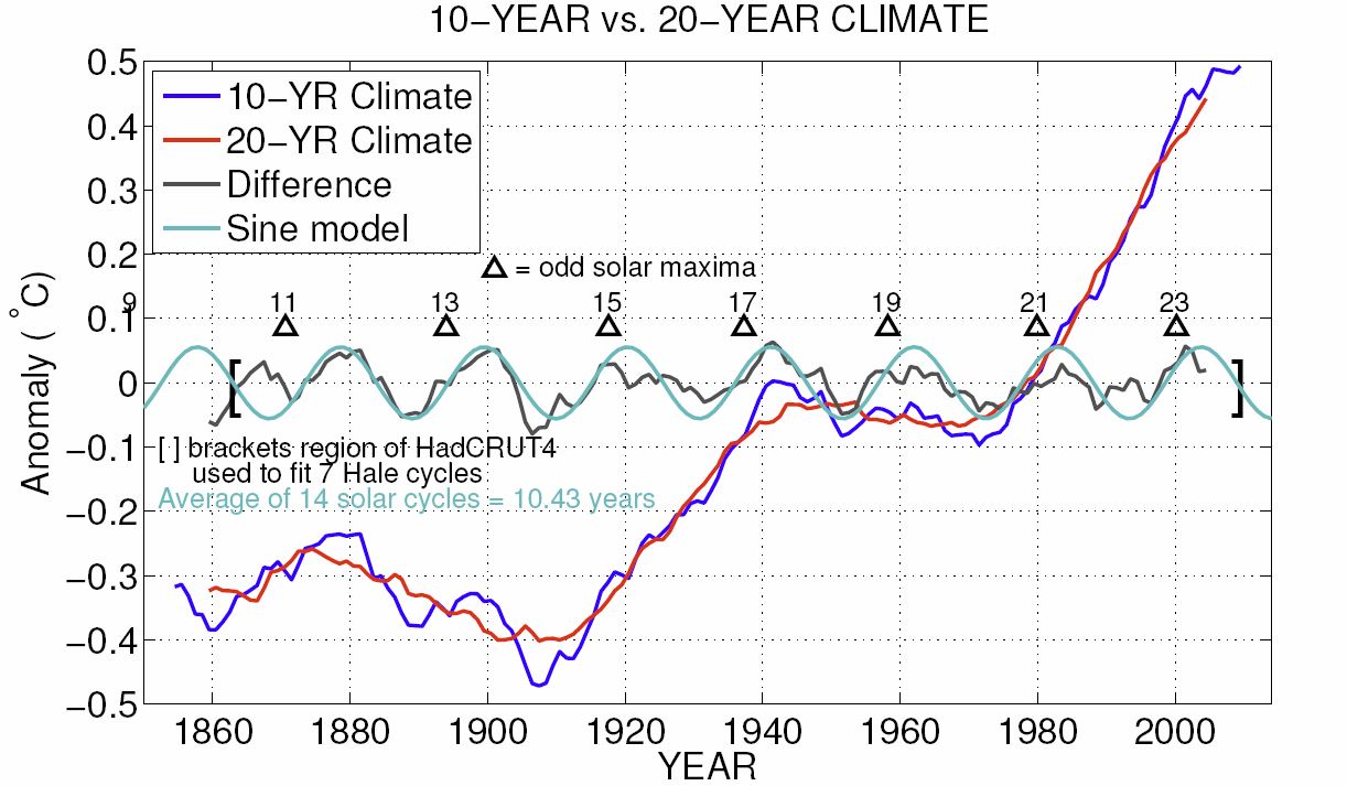
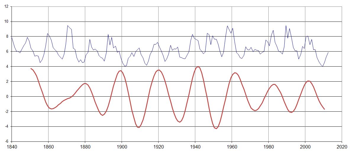
7. A correlation between solar cycles and 21-year climate
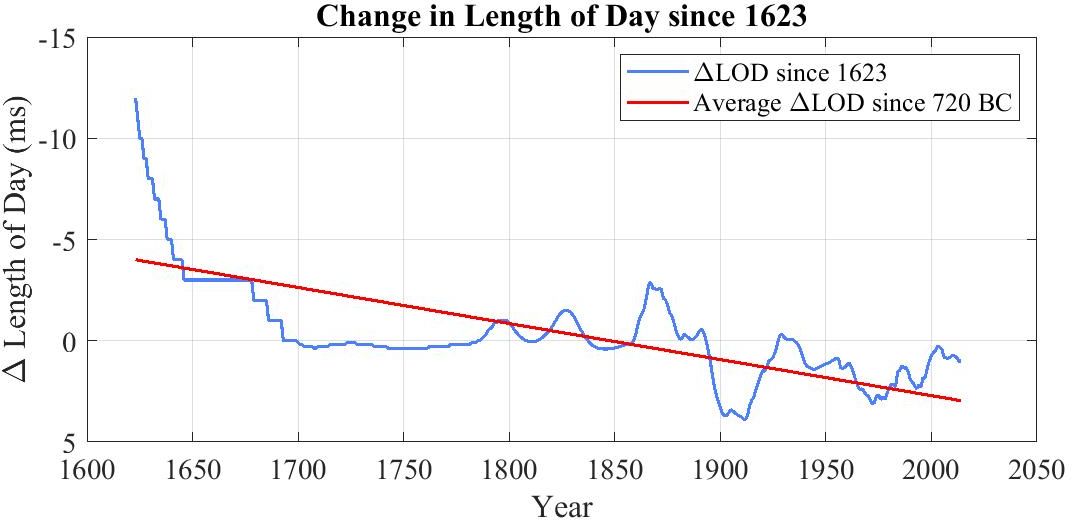
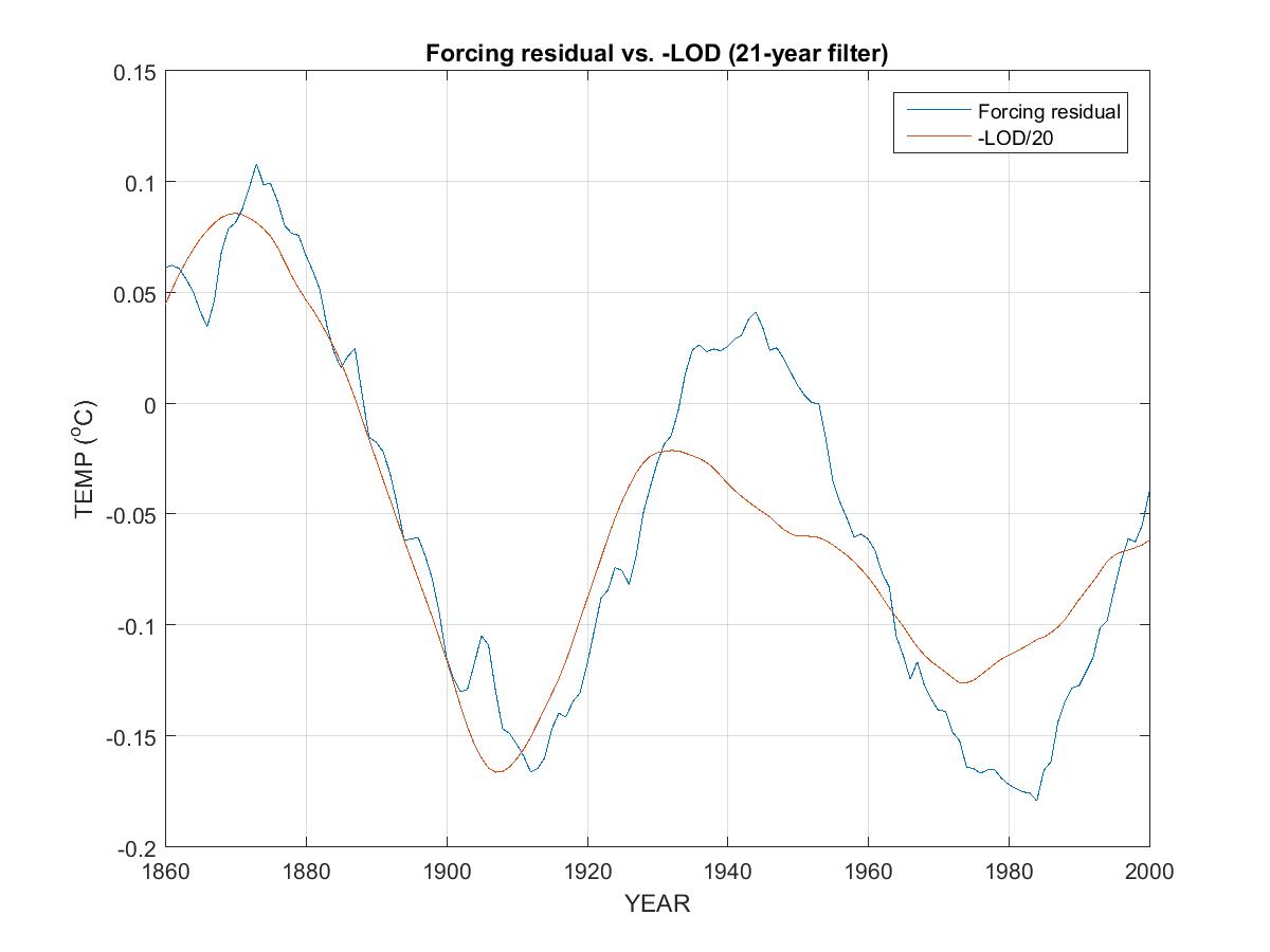
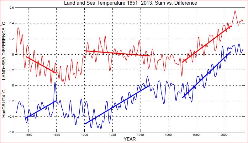
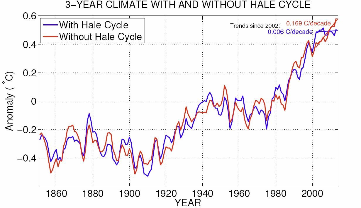
The following graph plots sunspot numbers (blue) and global climate (red) for the period 1865-2000. The latter is filtered with a 21-year bandpass filter so as to reject periods significantly higher or lower than 21 years. (This rejection is not sufficient however to remove an evident 63-year cycle well correlated with the inverse of Length of Day, LOD, whose manifestation in climate has a significantly larger amplitude than this 21-year cycle, more on this later.)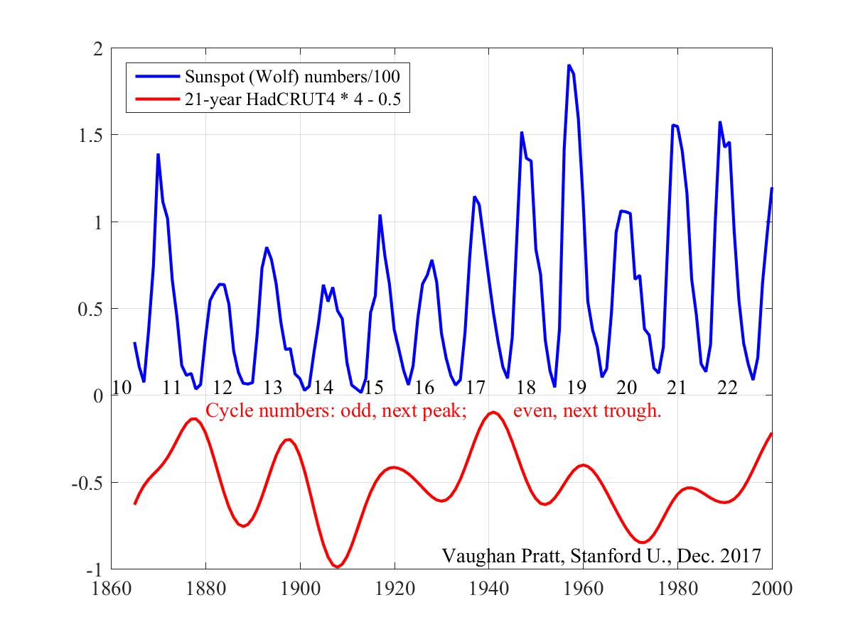
Another way to see the above-mentioned 21-year oscillation in HadCRUT4 is to fit trend lines to every decade or so of HadCRUT4, revealing essentially the same cycle.
As mentioned before this can explain the so-called ``hiatus'' during the first decade of this century, which was one of these downturns, along with the subsequent very steep rise during this decade, which is currently halfway through one of the upturns.
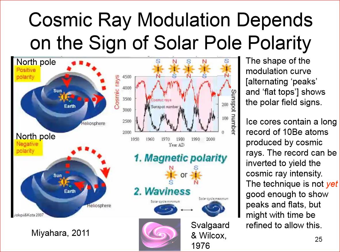
To date there is no agreed-on cause for this apparently strong correlation. What we do know is that Earth's magnetic field normally shields Earth from cosmic rays but this shielding is weakened when it couples to the anti-parallel HMF. One possible explanation of the 21-year climate oscillation is that water vapor molecules condense on aerosols ionized by cosmic rays, creating a nucleus for further condensation, similarly to how silver iodide seeds clouds. The resulting increasing cloud cover then cools the Earth. To date however no 21-year cycle in cloud cover has been detected. Hence either that effect is too small to be observed directly, or the explanation lies elsewhere, for example as an expression of the Gnevyshev-Ohl rule that odd-numbered cycles have more sunspots than even-numbered ones.
The most recent downturn in climate began in 2000 at solar max of cycle 23, and ended abruptly at solar max of cycle 24 in 2012 when HadCRUT4 began a dizzying 5-year rise of 0.37 degrees. Of the various suggested explanations of the so-called climate hiatus during the first decade of the century, this one seems particularly plausible.
This correlation can also be seen in Central England Temperature for
1659-2010, extended yet further back to 1550 by Dr. Tim Brown based on
southwest winds in Devon as a proxy. Interestingly the 21-year oscillation
in CET persists even during the Maunder Minimum, making it likely that
the heliomagnetosphere is still active even when sunspot activity
is negligible, as well as making the Gnevyshev-Ohl rule a less plausible
explanation. Solar cycle numbers earlier than -5 are inferred from the
oscillation in CET, whose period during the Maunder Minimum
would appear to be closer to 18 years than the subsequent 21 years.

8. Global Warming since 1850, in three stages.
This graph plots three stages of global surface temperature (both land and sea), as recorded in HadCRUT4, a dataset assembled from many hundreds of millions of measurements made at the surface. The first stage is the 108 years from 1850 to 1958, which trended up at 0.27 degrees Celsius per century. The next stage is the half century from 1958 to 2008, which trended up at 1.26 degrees per century. The last stage is the last ten years, from 2008 to (almost) 2018, which trended up at 3.86 degrees per century.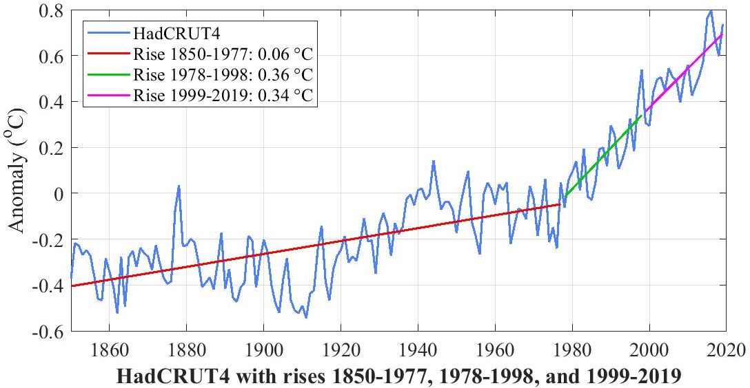
9. Three natural influences on multidecadal climate
Multidecadal climate refers to climate events that last longer than a decade. In the graph below, all faster events in the four plots have been removed with an 11-year moving-average filter, taking out the 11-year sunspot cycle, 7-year El Nino/La Nina events, coolings of at most 2-3 years due to recent volcanic aerosols, etc.
10-11. (These two section moved up to position -4.)
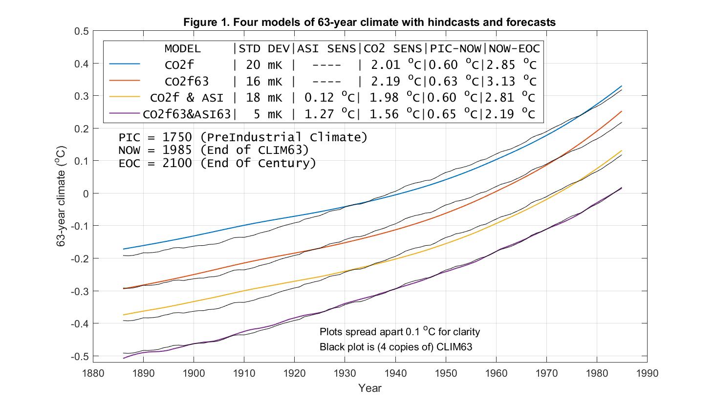
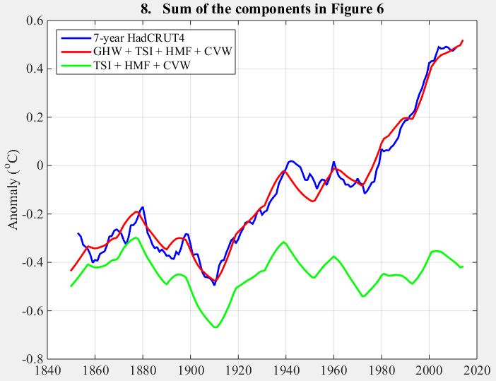
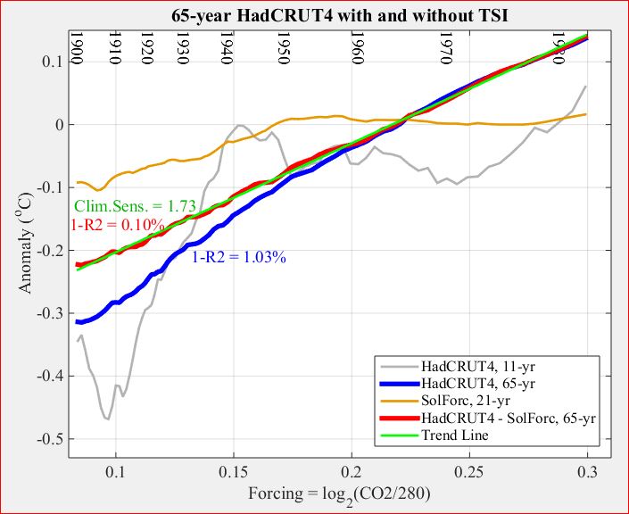
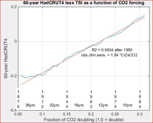
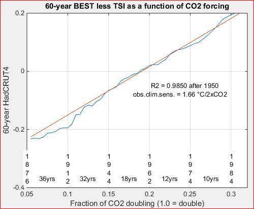
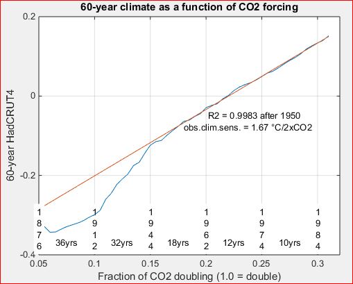
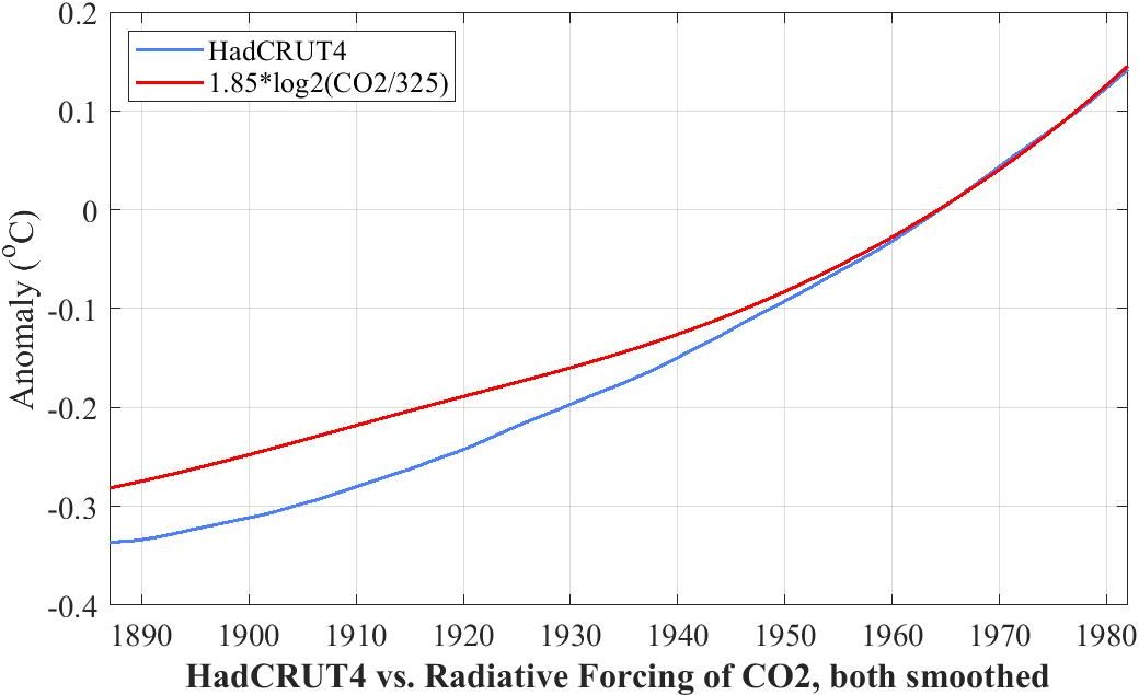
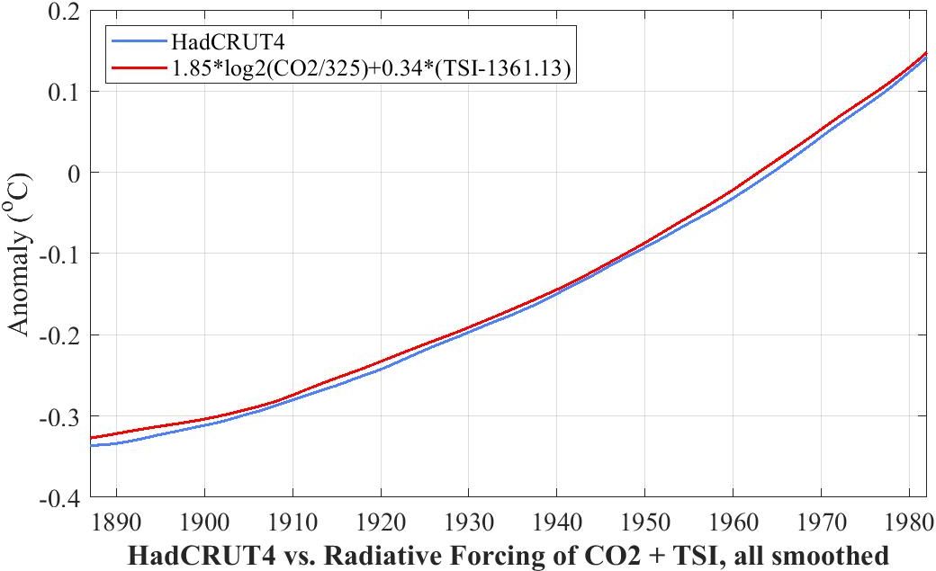
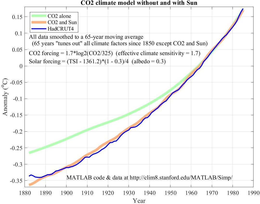
12. The need to include TSI when forecasting with 65-year climate
65-year climate is HadCRUT4 smoothed with a 65-year moving average
filter. As the three plots in the following figure show, 65-year climate
is not as well modeled by either Radiative Forcing (log(CO2)) or Absorbed
Solar Insolation (ASI = TSI*0.7) alone as by both together.
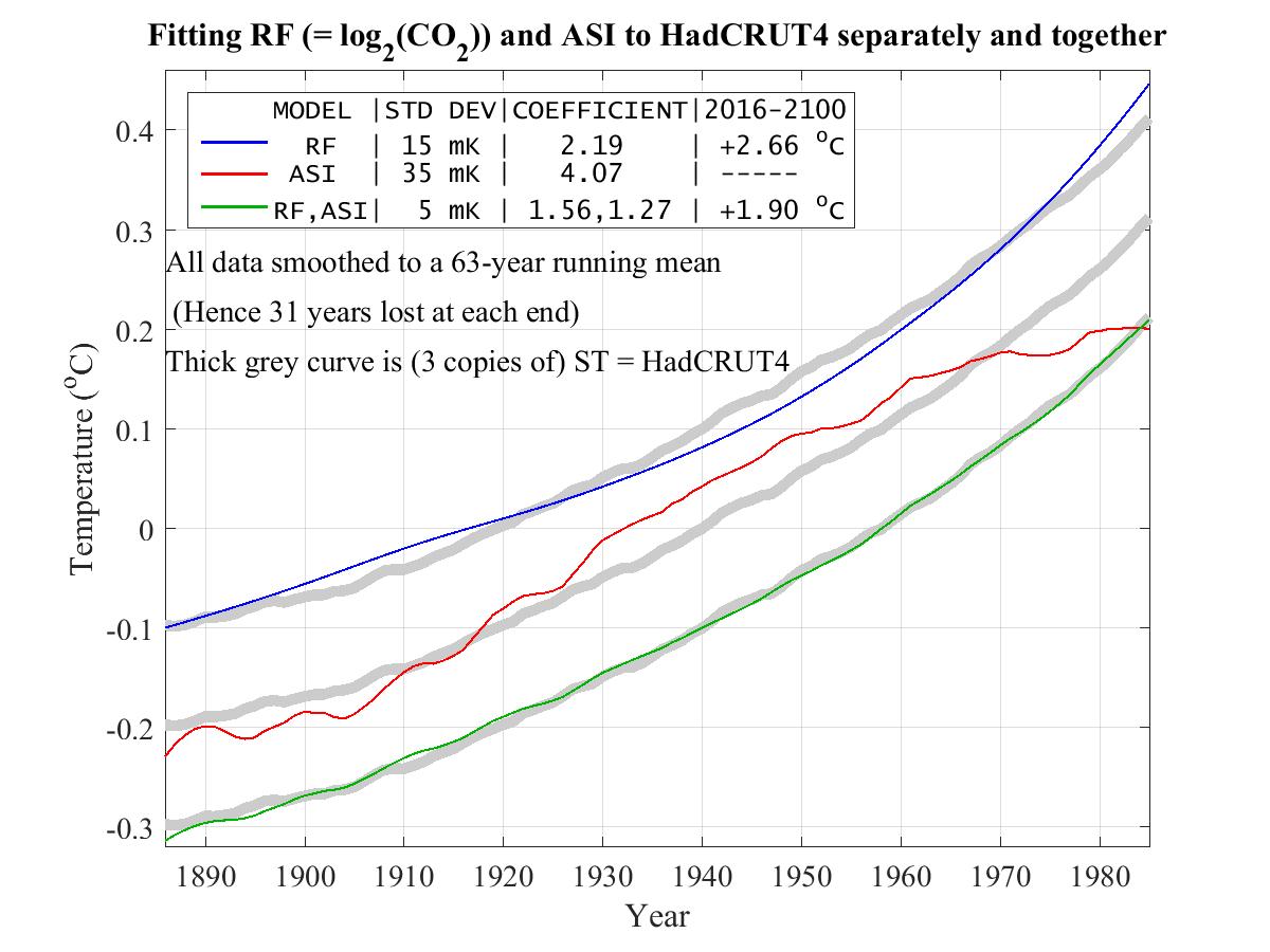
The three thick gray curves are copies of 65-year HadCRUT4 as smoothed
with a 65-year moving-average filter. The three fits are as follows.
What this graph forecasts with considerable confidence is not
climate in the year 2100 itself, but rather average climate,
averaged over the 65 year window at 2100, i.e. the average of the 65
years 2069-2131. Climate is always changing, and the best we can say
with any confidence about this graph's forecast is that about half
of those 65 years will likely be hotter than forecast and the other
half colder. While we can't say which of those years will be hotter,
we can be pretty sure that there will be some three decades
of hotter-than-forecast climate during the period 2069-2131.
This amounts to an uncertainty principle for modern climate. If we ask for temperature over a precisely defined short period in time we should not expect much accuracy in temperature. Conversely if we ask for much accuracy in temperature we should not expect to be able to achieve it for too precise a target in time.
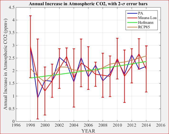
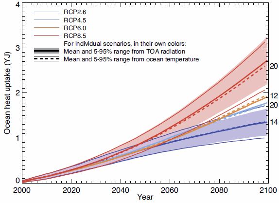
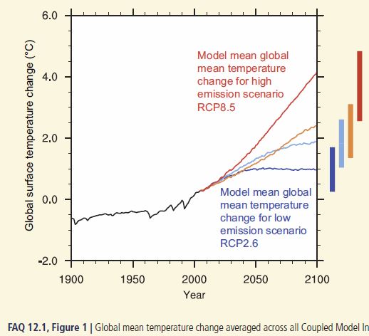
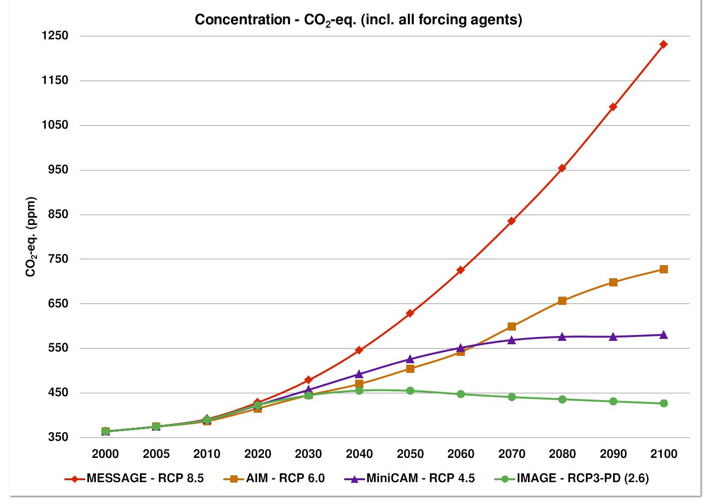
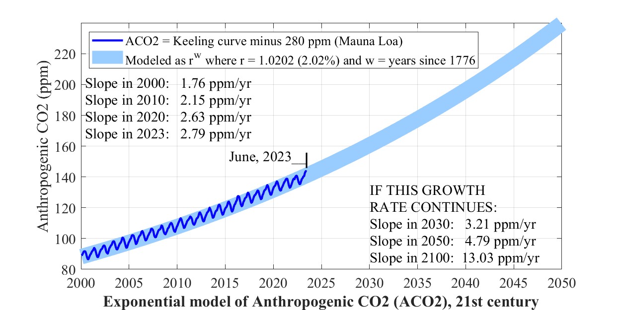
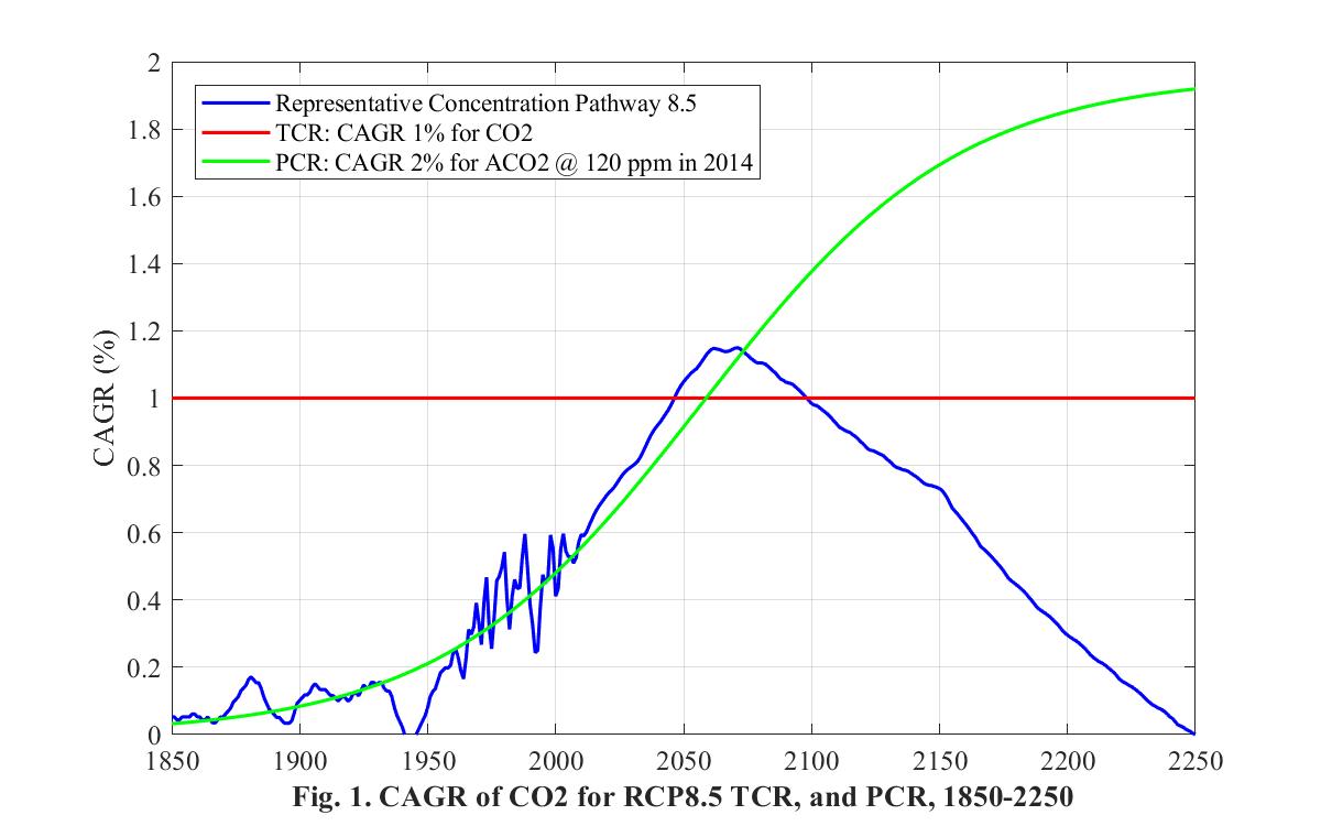
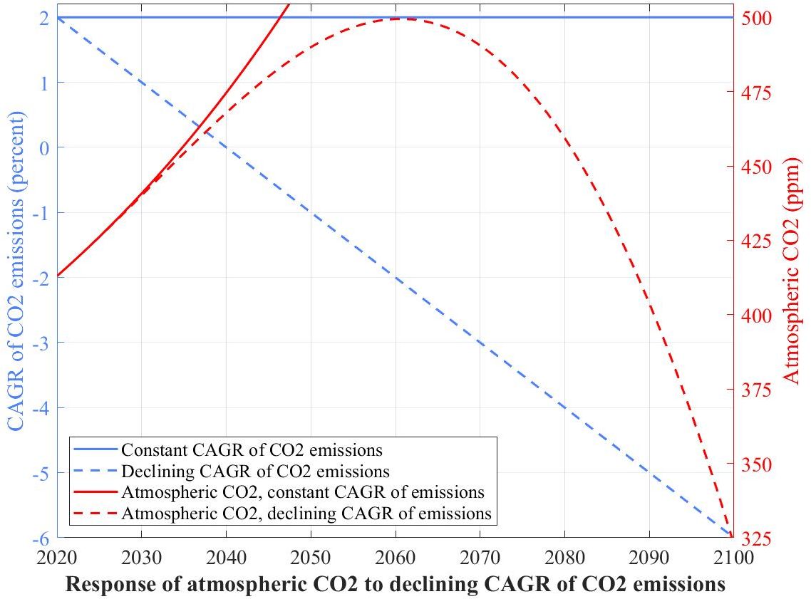
13. Compound Annual Growth Rate (CAGR) of Representative Concentration Pathway 8.5
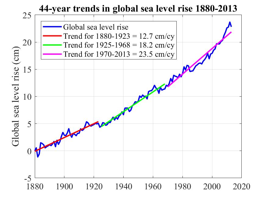
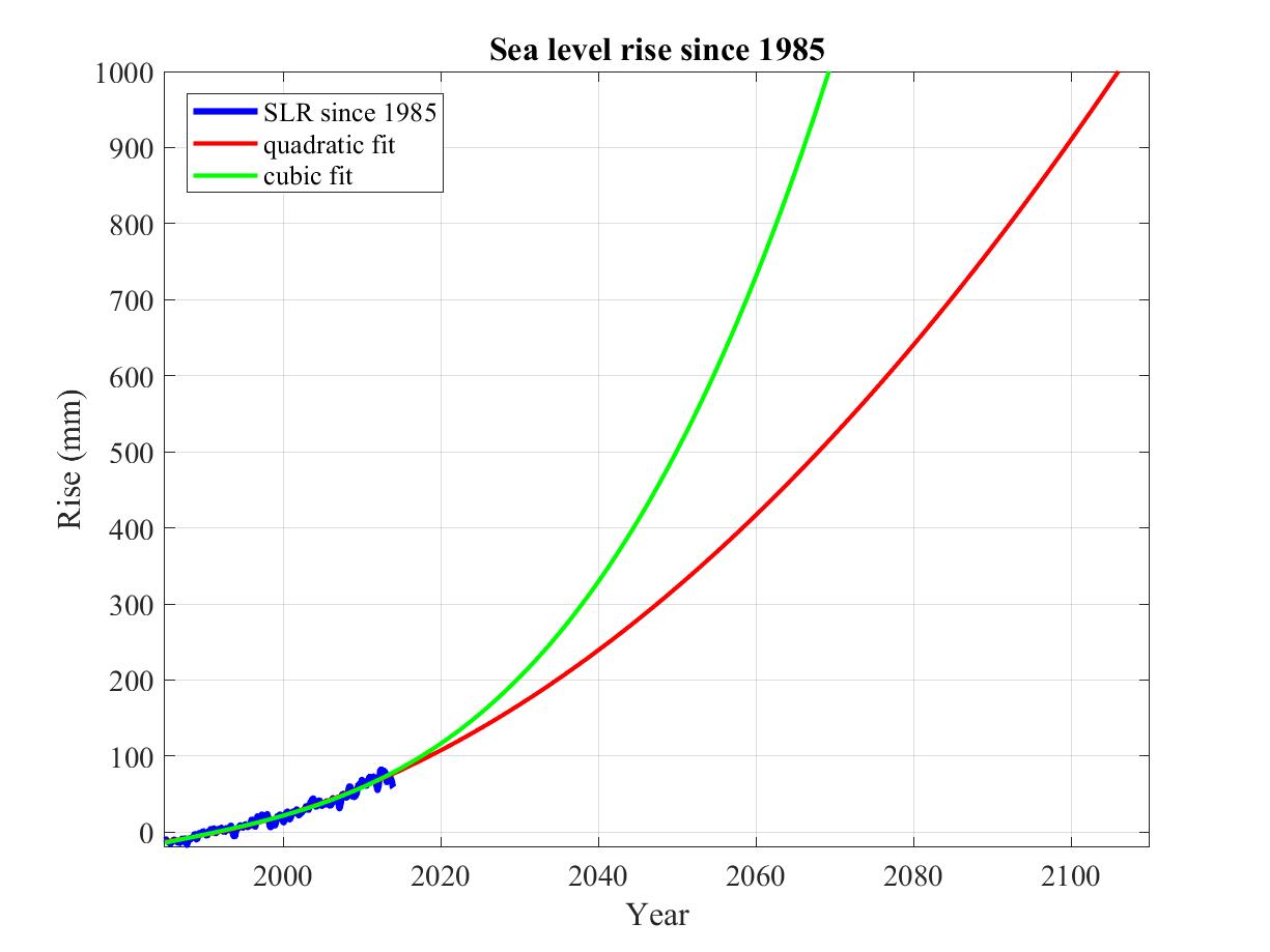
14. 44-year trends in sea level rise for 1880-2013
15. Amount of trash we put in the land, sea, and air, in millions of tons per year (log scale).
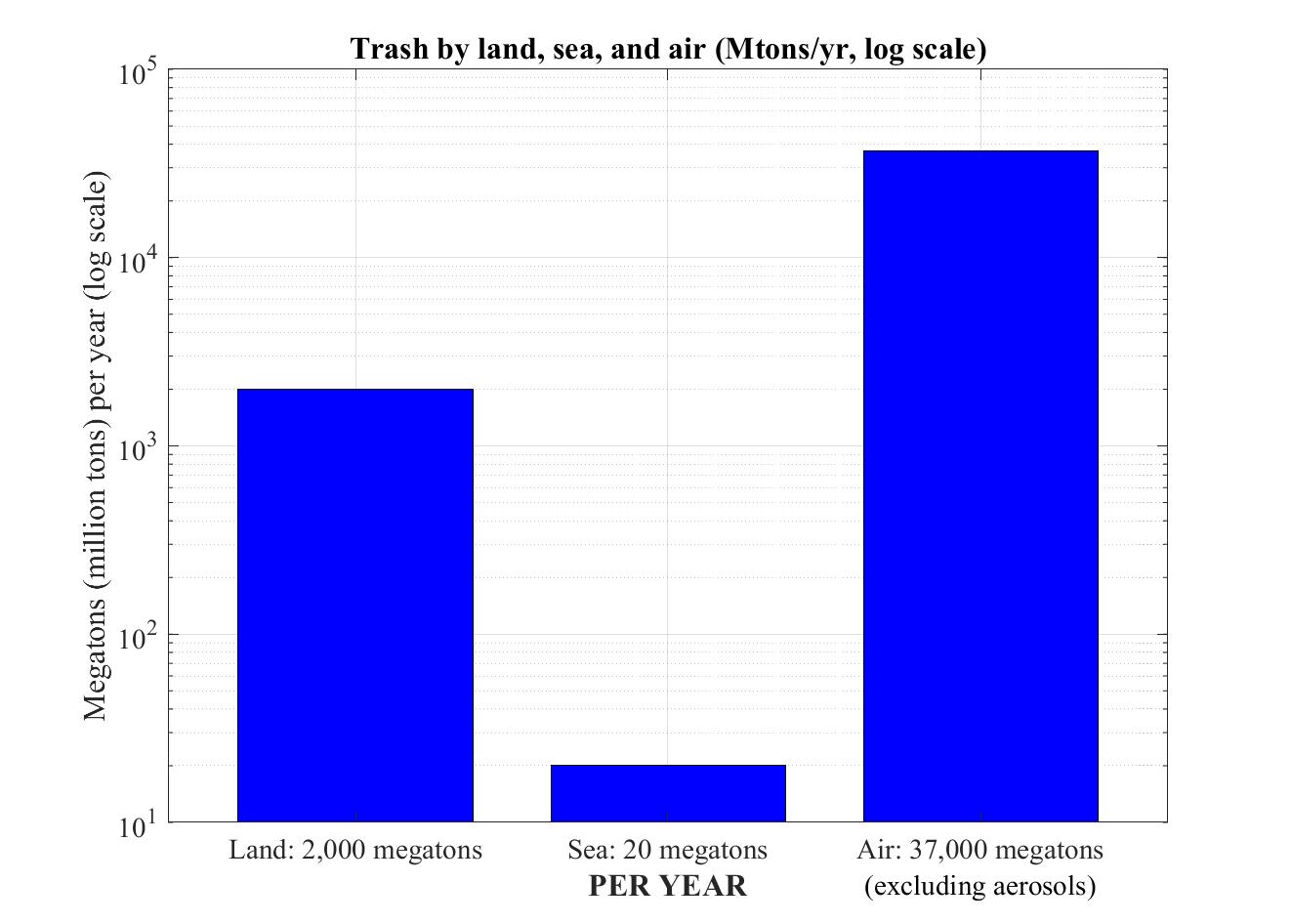
In billions of tons per year, these amounts are respectively 2, 0.02, and 37. The 37 billion tons of trash we put in the air is largely the combustion products from burning fossil fuels (coal, oil, gas), not counting water vapor and aerosols (particulate matter) since those have a residence time in the atmosphere of mere days.
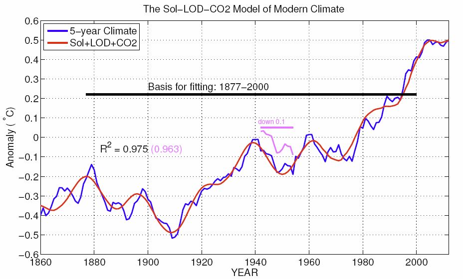
Fitting CO2 and TSI to HadCRUT4
Miscellaneous graphs, various sources, little or no annotation


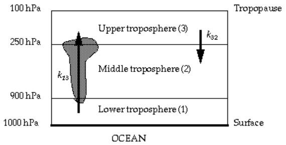
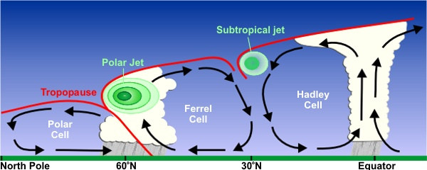
Troposphere structure as a function of latitude, and induced tradewinds.